Why I Built Flex Design System
Discover why I built Flex Design System — a minimal, professional Figma toolkit that helps UX & UI designers maintain consistency and flexibility across projects.
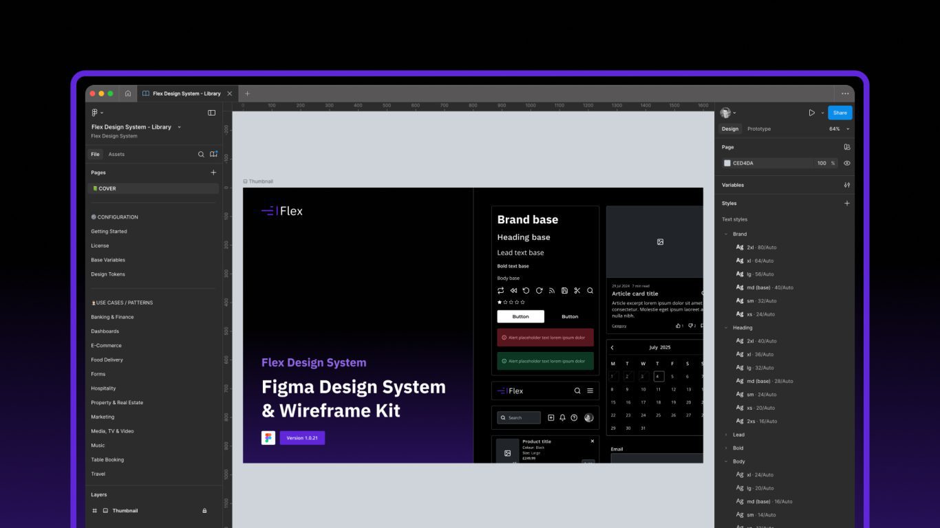
Table of contents
Over the years, I’ve worked in UX across a wide range of sectors – from luxury fashion to automotive, health & fitness to entertainment, and hospitality. One thing has always stood out: creating consistent, well-presented, user-friendly design at scale is challenging. It’s even harder when projects stretch over months or years, or when you’re working with large teams where people come and go. I built Flex Design System to help solve that.
Flex isn’t just another design system. It’s one I’ve carefully crafted for designers who care about the details and want their work to look professional, even in early wireframes. Whether you’re a UX or UI designer, or part of a wider product team, Flex is built to help you work smarter and stay consistent.
What Makes Flex Different
A System You Can Rely On
Flex has been shaped by years of practical experience. Every component, layout and pattern reflects the sort of real-world problems I’ve encountered time and again. It’s grounded in UX best practice and takes inspiration from systems like Carbon, Polaris, Bootstrap and Tailwind – while offering something more lightweight and independent.
I originally built Flex for myself – something I could use freely across all my client projects, without any licensing concerns or IP restrictions. I wanted a design system I could use easily, one I could stand by and be proud of. But I also knew other designers and teams might benefit from it too, so I decided to make it available as a paid product.
Built by One, with Dedication
Flex is a paid product because it was built by a team of one – me – on top of a full-time UX role. It took shape in the evenings, at weekends, and in spare moments over many months. It was driven by dedication, attention to detail, and a genuine love for thoughtful design.
By choosing Flex, you’re supporting an individual designer who’s invested time, care and craft into making something useful. That support makes a difference.
Even if you choose not to purchase, you can still use Flex Design System as a learning reference if you’re planning to create your own design system — the structure, approach and detail will still be helpful.
Designed for UX – and Ready for UI
Flex has been intentionally styled to be minimal and professional. It’s ideal for UX work and early wireframes – deliberately stripped back so clients aren’t distracted by polished visuals too early in the process. It helps keep the focus on structure, flow and functionality.
At the same time, it’s been built with flexibility in mind. You can extend it using themes (Figma modes) for UI work, allowing you to layer on branding, visual design and style when the time is right. This gives you the best of both worlds: shared components that work across both UX and UI, helping you stay consistent without duplicating effort.
Common Components – Custom Possibilities
Flex includes a wide set of common components, layout patterns and use case examples to help you get started quickly. Buttons, inputs, forms, navigation, tables, cards – it’s all there and ready to use straight away.
But it’s not just about speed. Flex also gives you the freedom to create what you need. You can mix and match components to design custom layouts for specific use cases. That balance between structure and flexibility is key: it’s what gives you the best of both worlds.
Thoughtfully Built in Figma
Flex takes full advantage of Figma’s and most powerful features:
- Smart auto layout applied consistently across all components
- Variants and nested components that behave intuitively
- Clean, reusable styles and tokens for colour, typography and spacing
- Responsive templates and page layouts that adapt effortlessly
- A clear, logical structure that makes the whole thing easy to navigate
It’s been designed with care and attention to detail, so you can stay focused on solving problems – not wrestling with inconsistent files.
Consistency at Scale
If you’ve ever worked on a large or long-running digital product, you’ll know how quickly standards can drift. Components get duplicated. Spacing goes rogue. Design debt builds. Flex is here to stop that from happening.
It gives you a solid, reusable foundation that keeps things consistent across teams, timelines and tools. Whether you’re working solo or collaborating with others, it helps maintain a clear, shared design language – from early UX thinking through to polished UI.
Final Thoughts
Flex was made out of necessity – to bring clarity and consistency to my own work. It’s a system that supports good design, without getting in the way. Something I genuinely enjoy using and now want to share with others.
So what was the point? In the age of AI, am I not about three years too late to the party? Possibly. Did the world need another design system? More than likely not. Did I just rip off some client project and repurpose for myself? Absolutely not. Will I be able to retire off the proceeds? LOL. Am I super proud of what I’ve put together? 100%.