Design Smarter with Design Tokens in Figma
In this article, we’ll explore design tokens—what they are, how they work in Figma, and how they bring structure, consistency, and flexibility to your UX/UI designs.
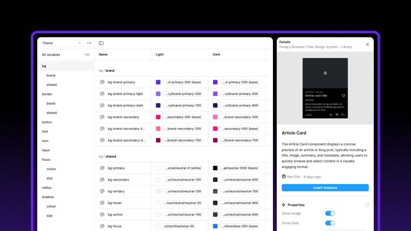
Table of contents
Introduction
Designing across breakpoints, brands, or languages can get messy fast. As projects scale, maintaining consistency and avoiding repetitive updates can become a real challenge.
Whether you’re new to design systems or are a veteran and want to further optimise your existing workflow, this article explores how token-based design in Figma can help bring clarity, consistency, and adaptability to your design workflow.
What Are Variables?
Put simply, variables are just a way to store single values which can then be retrieved and used within a design or application. They are comprised of a name and value and form the foundation of a design system.
Figma supports four types of variables: colour, string, numeric, and boolean.
- Colour variables are used to store colour values for use in visual themes like light and dark modes.
- String variables are used for labels, headings or even storing translated strings for localisation.
- Numeric variables handle values like spacing, font sizes, border widths or radii.
- Boolean variables are used to create toggles – for example, adjusting layout visibility.
Together, they form a powerful toolkit for building flexible and responsive design systems.
Variables can be grouped in Figma to maintain a clean and scalable structure. Simple use a forward slash in the name (bg/bg-primary), or drag and drop the variables into an existing group. This makes it easier to manage, browse and apply them consistently across a complex design system.
What Are Styles?
Figma styles and variables serve different but complementary purposes, and understanding their roles can help you build more flexible and maintainable designs.
Just like in CSS, styles in Figma are collections of multiple values grouped together. A text style, for instance, may include font size, weight, line height, and letter spacing — all bundled into one definition. This makes styles perfect for applying consistent visual formatting across a design, particularly for typography or effects.
Variables, on the other hand, store only a single value: a number, colour, string, or boolean. They offer more flexibility and control when you want to manipulate design attributes individually or dynamically across different contexts.
While styles are still widely used — especially for managing typography, grids, and effects — it is now best practice to use tokens inside them for maximise flexibility.
What Are Design Tokens?
Design tokens are named entities that reference the variable values stored in Figma. Rather than using variables like 16px or #1D1D1D directly in your designs, tokens act as an bridge — a label you apply to a design property that points to an underlying variable.
This is important for a few reasons. Firstly, it future-proofs your designs. If a value changes — say your spacing scale shifts or your brand colour updates — you can update the variable once and all tokens pointing to it will reflect the change. Secondly, it creates consistency and reduces the chance of design drift over time. Finally, it makes designs easier to adapt to different contexts, like themes or languages, by simply switching modes in Figma.
How to Name Design Tokens
Good token names should reflect purpose, not value. That way, even if the value behind a token changes, the name still makes sense. For example, a token named spacing-md might point to 16px today, but could shift to 20px in a future iteration. Because the name describes intent — a medium spacing value — the update doesn’t break anything or require renaming.
This is why we avoid overly specific names like spacing-16. It ties the name to a number rather than its use. A more semantic naming system, like spacing-sm, spacing-md, and spacing-lg, keeps things scalable and easier to manage.
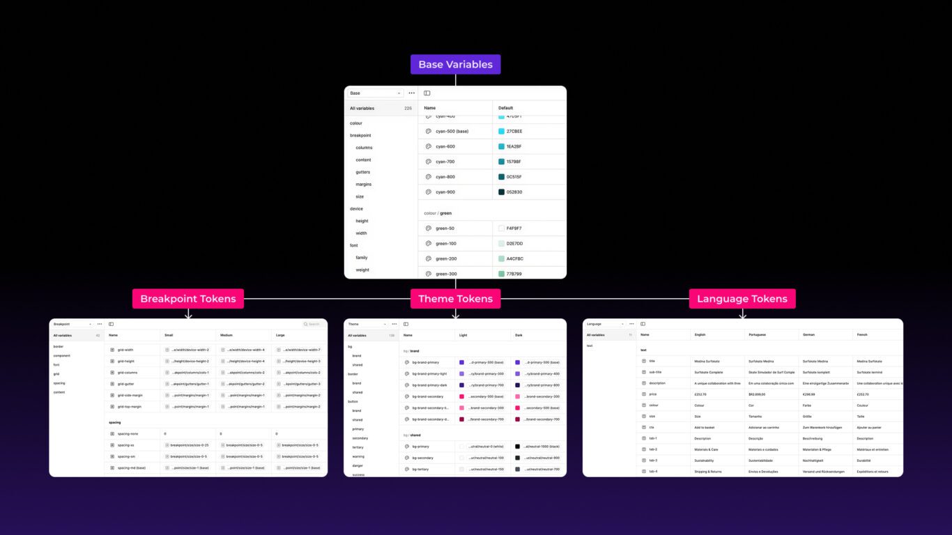
How Flex Organises Variables And Tokens
In Flex Design System, tokens are consistently named and intentionally organised into specific collections: Base, Theme, Breakpoint, and Language.
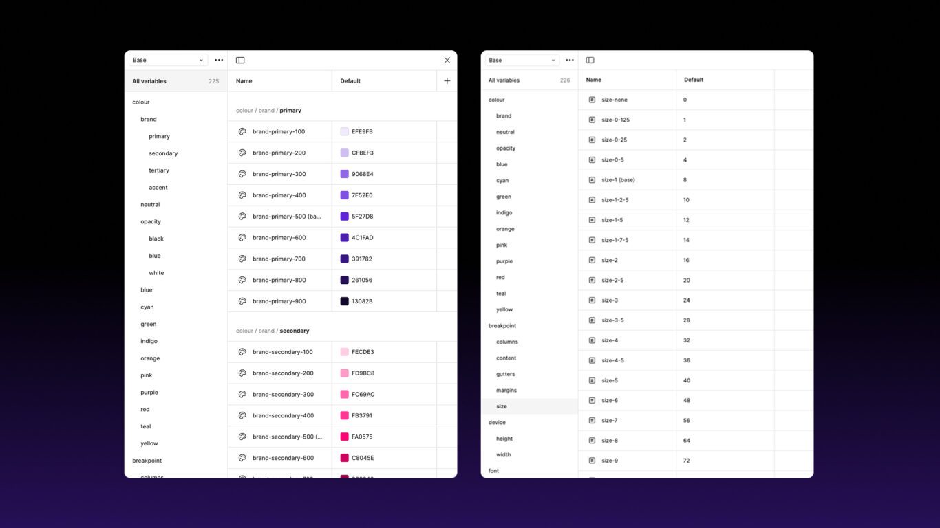
Base
Base is where all the raw variables — base colours, spacing units, font scales and more. These are the fundamental variables (sometimes called primitives) — colours, numbers, radii — that everything else is built on.
Theme
Theme handles light and dark modes. These are references to Base values and include tokens such as like bg-primary. Depending on the mode, this can point to say either blue-400 or blue-800 depending on the mode.
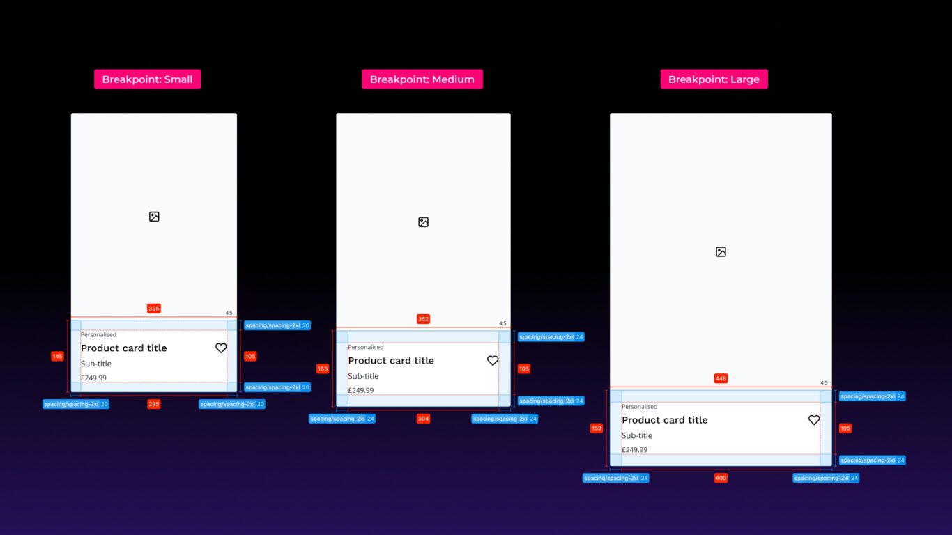
Breakpoint
Breakpoint adapts values based on screen size. Spacing and typography might scale for small, medium and large screens.
Language
Language handles the fiddly differences in text length that come with localisation. Things like button widths or layout spacing might need slight tweaks depending on whether the content is in English, French, German or Portuguese.
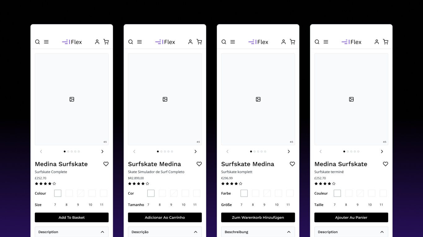
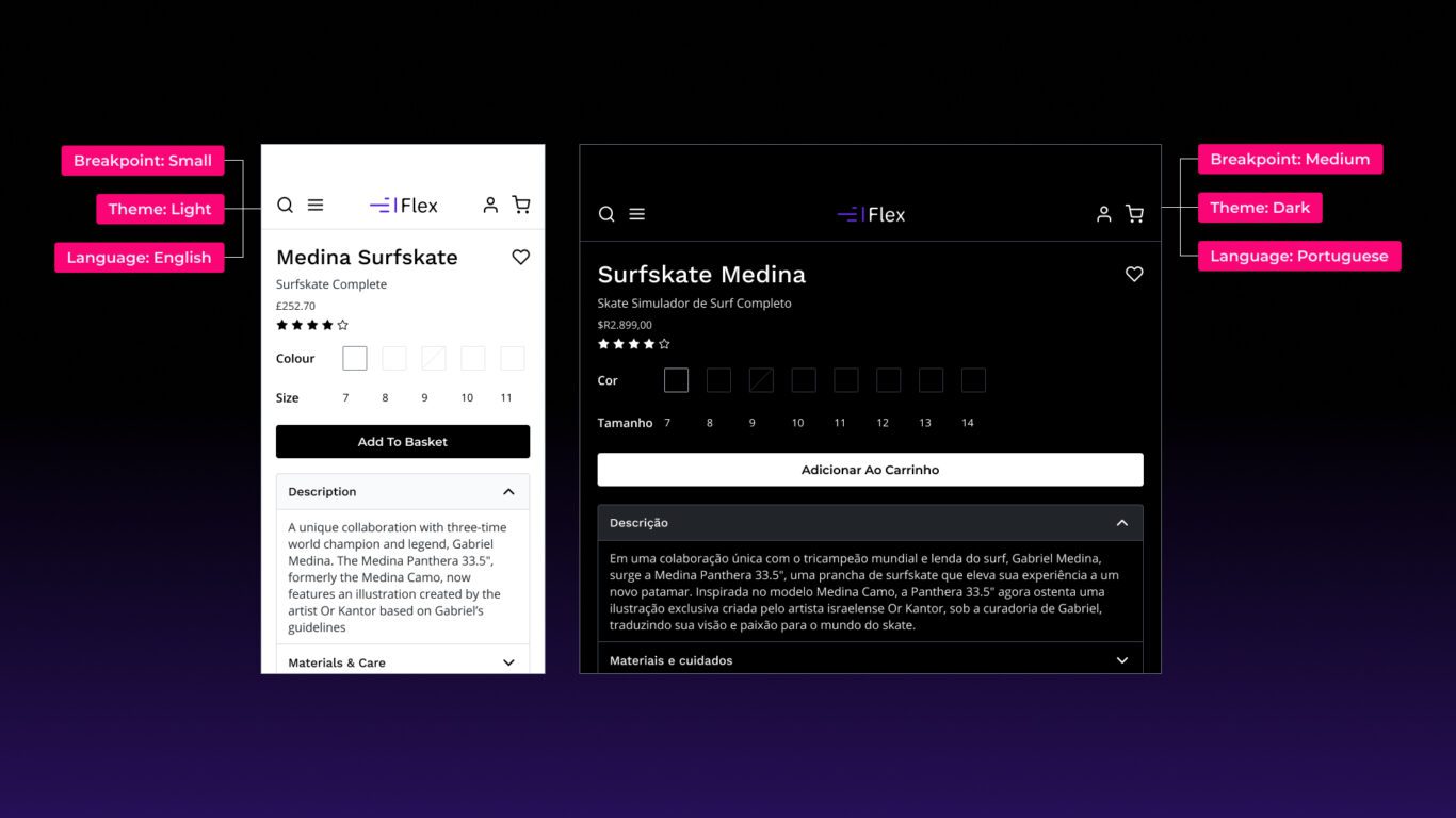
Collection Structures Matter
The separation into multiple collections isn’t just neat organisation — it’s what enables multiple modes to be applied to a single design (Figma frame) at the same time.
For example, say you’re designing a product details page (PDP) that needs to adapt across three breakpoints (mobile, tablet, desktop), two themes (light and dark), and multiple languages (English and French). With Flex’s collection structure — Base, Theme, Breakpoint, and Language — you can design once, attach the relevant tokens, and then use Figma’s mode switcher to see how it responds in any combination of context.
This means you can preview a mobile layout in dark mode in French, or a desktop layout in English with light mode, all without duplicating components or manually overriding values. It’s all driven by how those tokens are organised, allowing for true flexibility and rapid iteration.
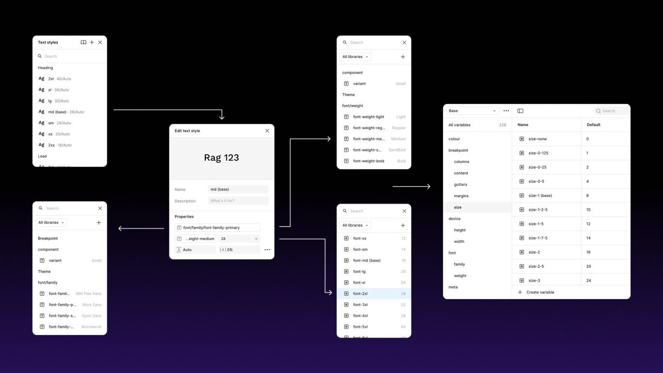
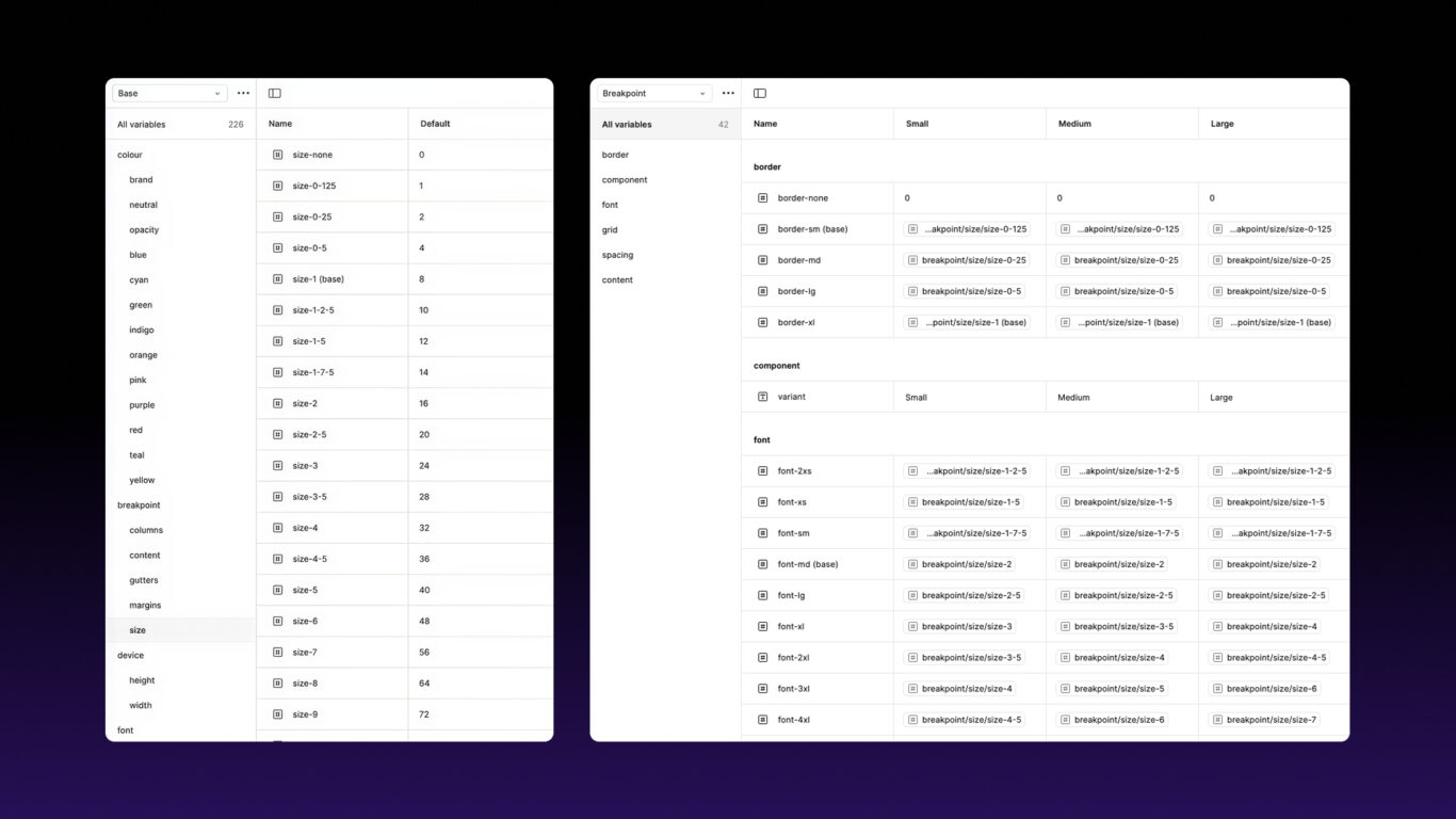
The 8pt Scale
All sizing in Flex is built off the 8pt scale. That means all spacing and sizing values are either multiples or fractions of 8. So you’ll see variables such as size-2 (16px) being used in multiple contexts, whether that for typography or spacing.
Through the use of tokens our typography can be automatically responsive. All we need to do is just configure the tokens to point to different values across breakpoints. So font-lg can point to size-2 (16px) on mobile devices, size-2.5 (20px) on tablet and size-3 (24px) for desktop. Then all you need to do is apply that token as you design and then switch the Breakpoint mode when you duplicate the frame, and you typography will automatically update.
Spacing can behave in exactly the same way. And the best part is you have complete control over how things scale (or not), the tokens are there, it is up to you have you configure them.
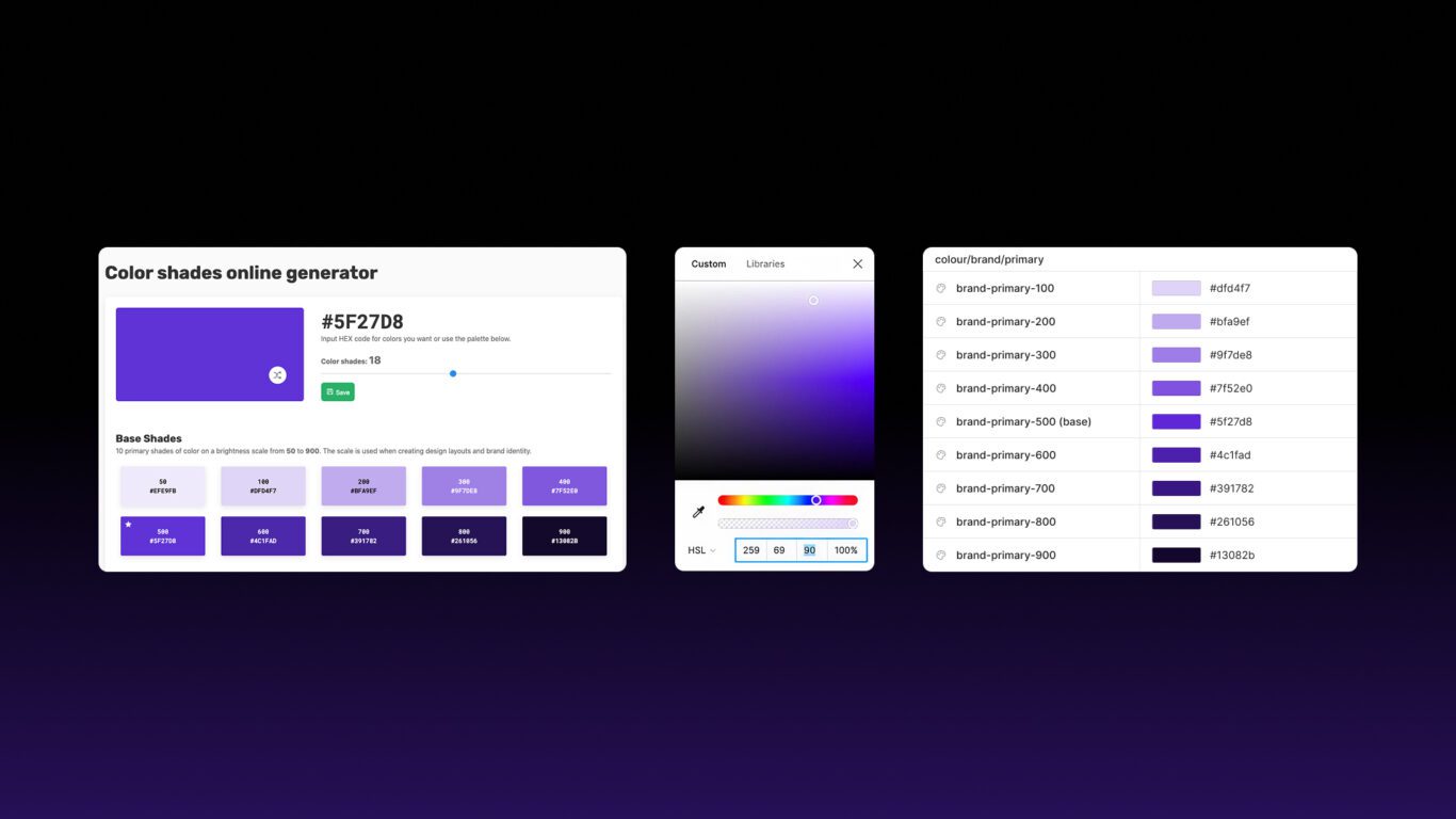
Colour System
Flex Design System uses a structured colour system that follows a familiar and scalable pattern. Each hue begins with a base colour (e.g. blue-500), from which a range of lighter and darker shades are generated. These shades follow a consistent numeric scale — typically 100 through 900 — where lower numbers are lighter and higher numbers are darker.
Colours are grouped by hue (e.g. blue, red, grey), and Flex also includes specific brand colours for customisation and differentiation. These base colours and their shades are stored as colour variables within the Base collection.
Semantic design tokens in the Theme collection then reference these variables. For example, a token like bg-primary might point to neutral-200 (light grey) in light mode and neutral-700
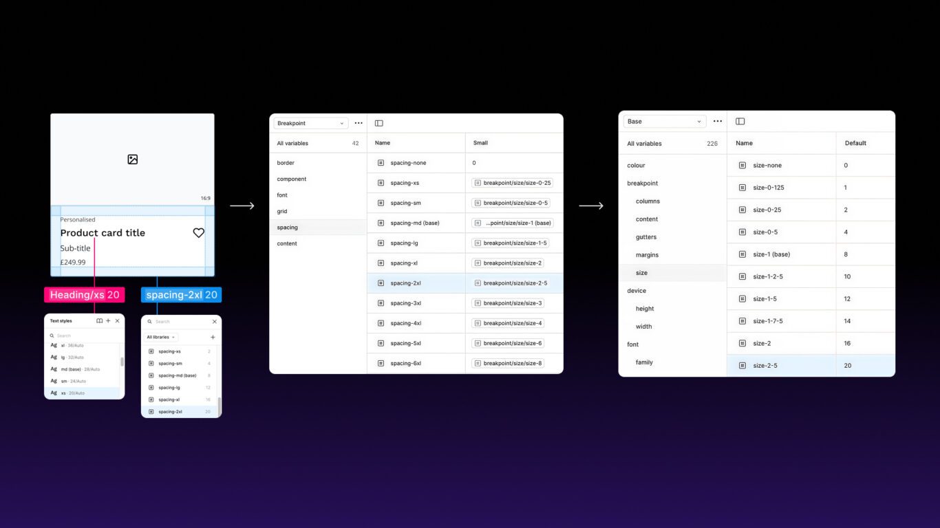
A Real-World Example
Here’s how it works in practice. One of the components I revisit often is a flexible product card. Every property — from padding, typography, background colour and border radius — is powered by tokens.
I create the component and apply the tokens as I am designing. When I am ready to test them across different breakpoints the cards adjust automatically when I apply a different mode.
It’s a perfect example of how token-based design underpins consistent components.
Final Thoughts
Tokens aren’t just a technical solution — they’re a smarter way to design. They bring structure, clarity and adaptability, all while ultimately saving time.
By separating values from usage, you make your work more scalable, more consistent, and a lot easier to maintain.
With systems like Flex, tokens don’t just support design — they power it.