How to Create Responsive Components in Figma
In this article, we’ll explore how to create responsive components in Figma using Flex Design System and design tokens. The practical e-commerce example covers a scalable product card and breakpoint-specific navigation.

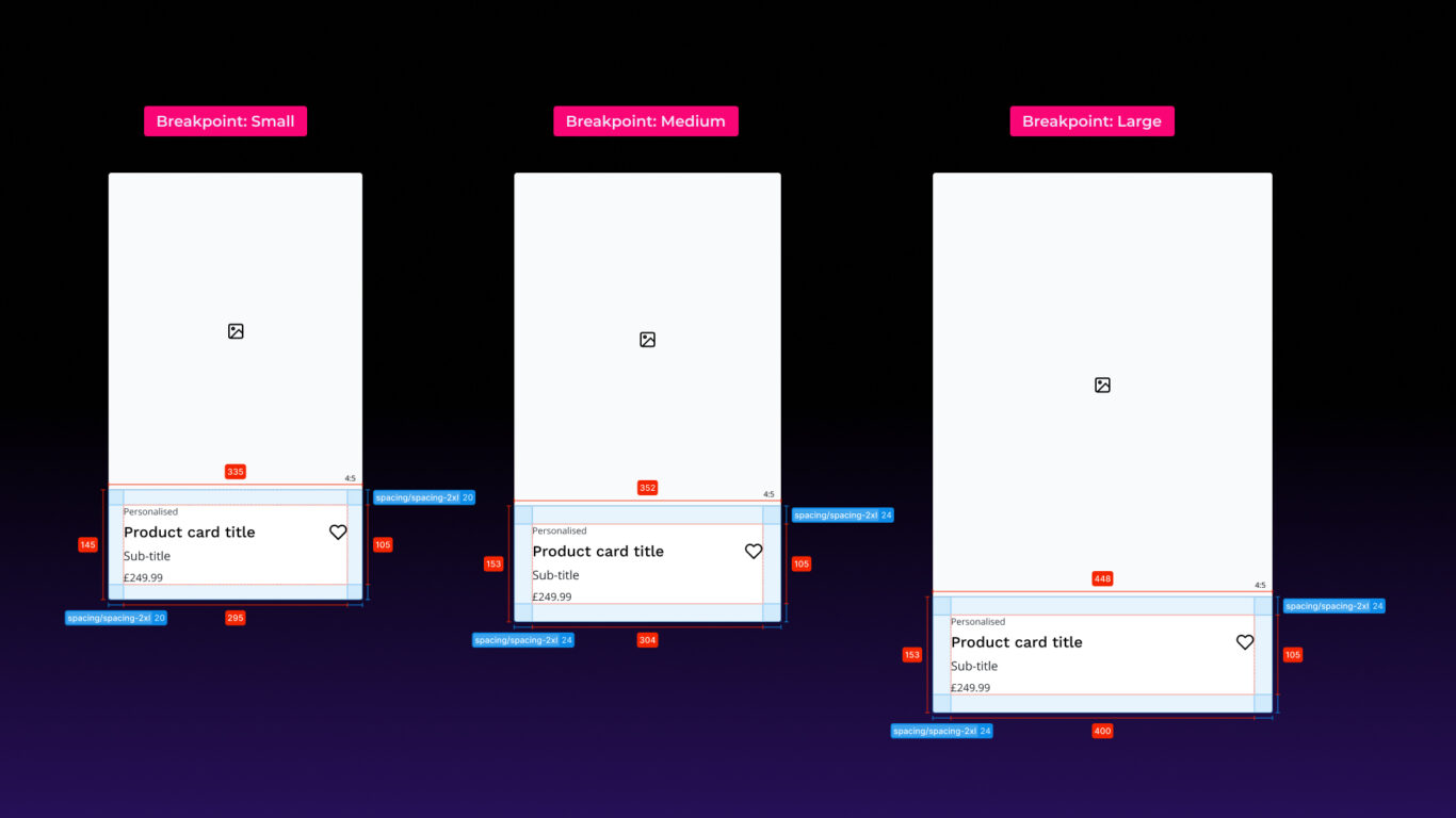
Table of contents
Introduction
Responsive design and atomic design principles have been around for well over a decade. Ethan Marcotte coined the term responsive design in 2010, arguing for layouts that adapt fluidly to screen size. Brad Frost introduced atomic design in 2013, setting out a method for building interfaces from a system of reusable components. Both ideas still shape how we design today.
Every modern digital product is expected to work across multiple breakpoints. Designing for that under tight deadlines is hard, so you need a workflow that gives you speed without giving up consistency or long-term maintainability.
A design system helps a lot here. In Figma, Flex Design System gives you a structured, token-driven approach to building responsive components and layouts.
This guide focuses on two e-commerce components: a product card and a header navigation. It covers when to use a single responsive component versus breakpoint-specific variants, and how to use variables and modes with Auto Layout to scale components and swap instances automatically.
How do design tokens simplify responsive layouts?
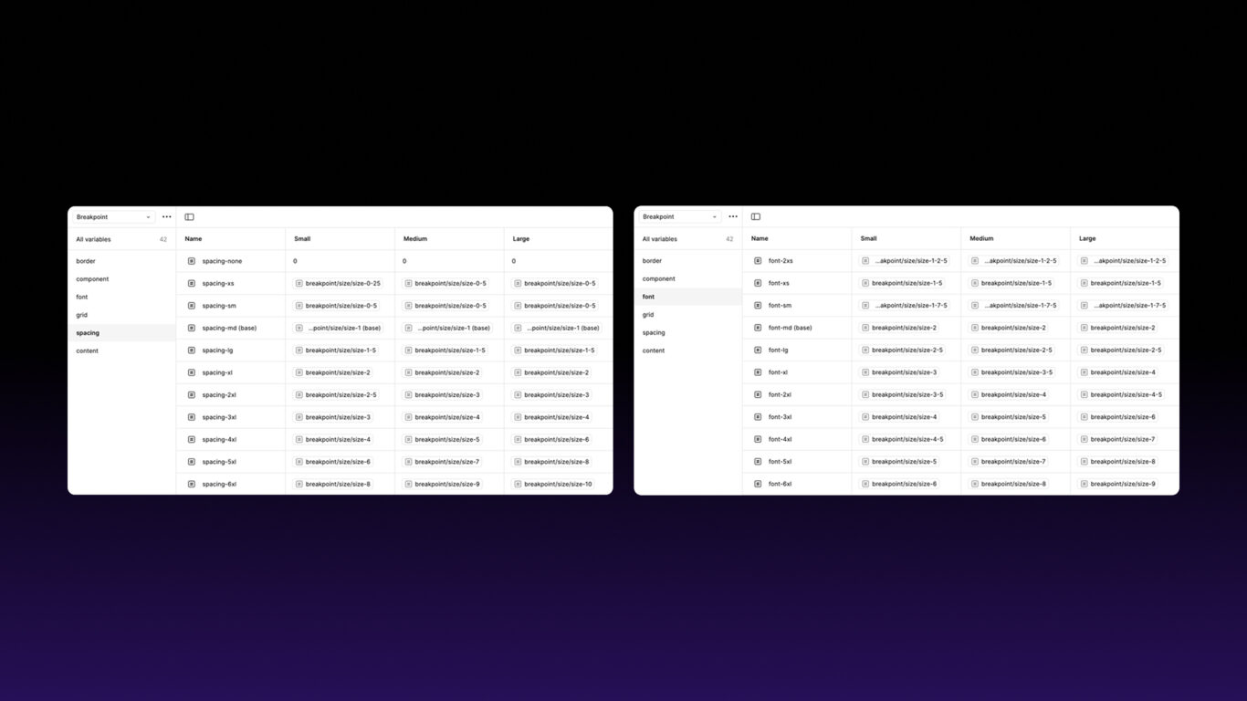
You could set fixed pixel values for every element and update them by hand at each breakpoint. Or you can use design tokens (Figma variables): reusable values that change automatically when you switch modes. Update a token once and it updates everywhere it’s used.
Design tokens in Flex Design System
Flex’s responsive tokens live in a variable collection called Semantic / Breakpoint. It has three modes: Small, Medium and Large. Each token in it resolves to a different value per mode, so switching a frame’s mode resizes everything inside it.
For these examples, we’ll focus on:
- Spacing (e.g.
spacing/sm,spacing/md): a scale fromspacing/noneandspacing/xsup tospacing/6xl. Use it for padding and gaps so layouts stay balanced at every breakpoint. - Content widths (e.g.
content/width-md): a scale fromcontent/width-2xstocontent/width-xl. Use it to set the minimum or maximum width of a component so it stays aligned and readable on any screen size. - Screen width (
screen/width): the frame width for the current breakpoint, from mobile to desktop. - Grid (
grid/columns,grid/gutter,grid/margin): column count, gutters and outer margins for each breakpoint. - Breakpoint variant (
variant/breakpoint): a string variable that tells breakpoint-specific components which variant to show.
Typography works slightly differently. Headings and body copy use text styles such as heading/md and body/md. Their responsive sizes are controlled by variables in the background, so you apply the style once and it resizes with the mode.
For the full token structure, see the Design Tokens and Variables docs.
When should you use a single responsive component?
Some components, like product cards, have a structure that stays the same across devices. For these, you can build one responsive component in Figma and let Auto Layout and design tokens handle the breakpoint differences.
How to make the product card responsive
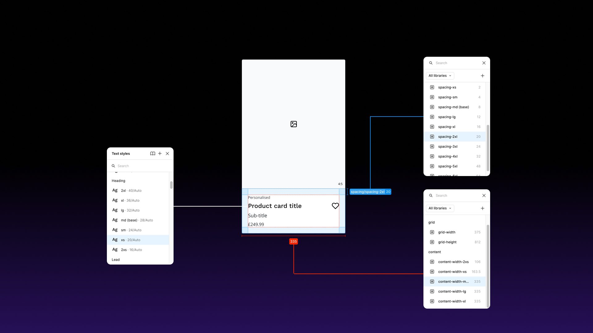
Once your card elements are in place (image, text and so on), apply tokens and styles to control responsive spacing and typography:
- Apply spacing tokens and text styles
spacing/mdfor the content padding.heading/mdfor the product title andbody/mdfor the description.
- Set Auto Layout and constraints
- To make cards scale automatically, apply Auto Layout and set their width to Fill container.
- To limit how wide or narrow a card can get, set a min or max width using a
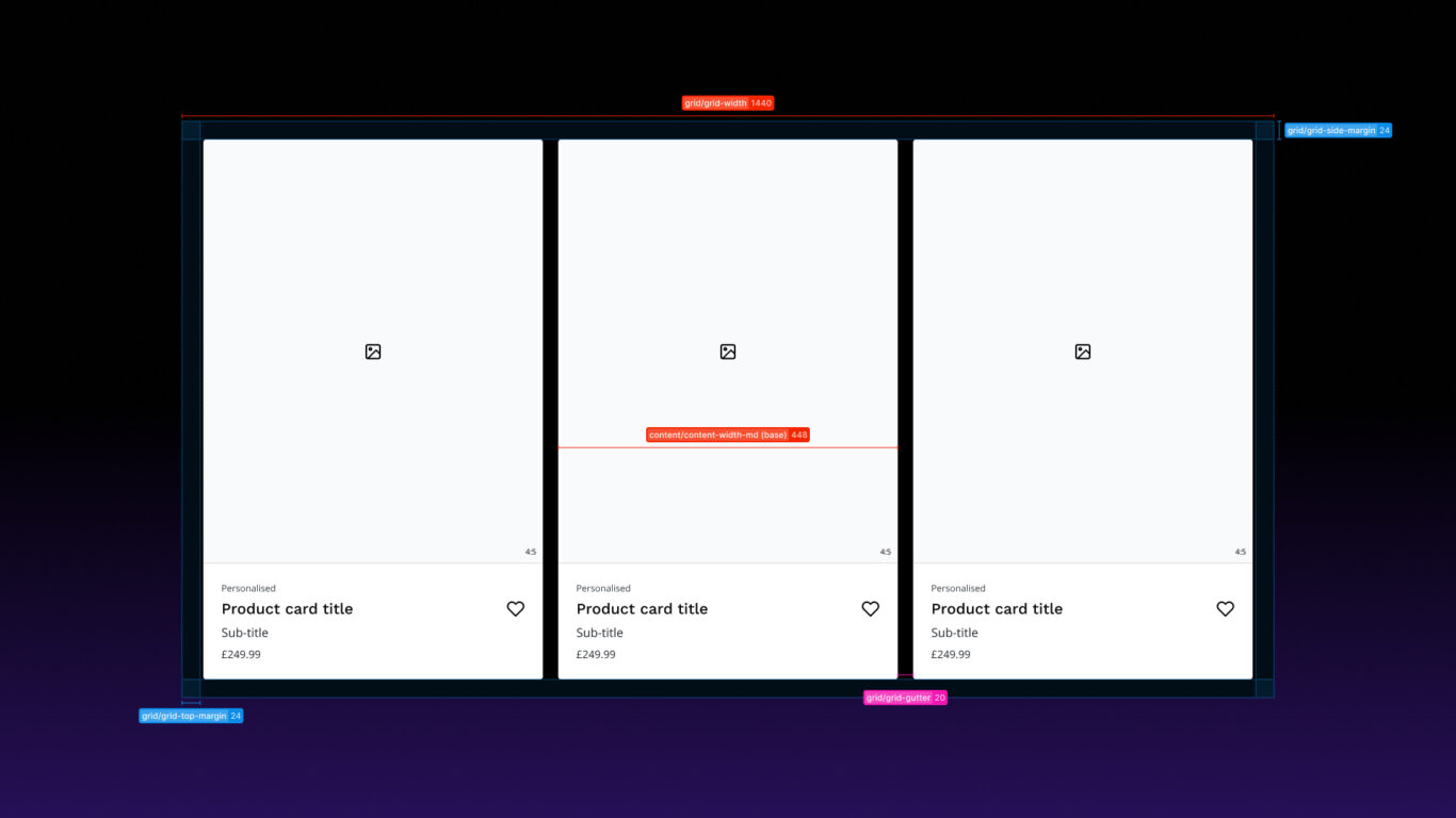
content/widthtoken. - Finally, apply the grid tokens to the parent frame to control the space between and around the cards:
grid/gutterfor the gap between cards andgrid/marginfor the outer margins.
For more on how the grid is set up, see Grids & Spacing and Typography.
When do you need breakpoint-specific components?
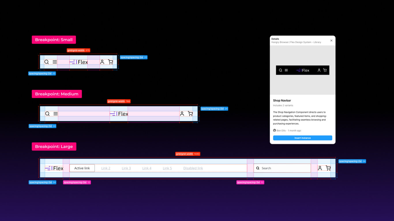
Sometimes a component needs a different design at different breakpoints for usability reasons. Navigation is the obvious example: a horizontal menu on desktop and a hamburger menu on mobile.
Breakpoint-specific components let you tailor the layout for each screen size while keeping the same functionality. Pair a component set with a string variable, and the right variant appears automatically for the mode you select.
How to create component variants that switch with variables and modes
Instead of building three separate navigation components for mobile, tablet and desktop, you can build one component set with variants and use variables and modes to switch between them automatically.
Using Flex? The variable and modes are already set up in the Semantic / Breakpoint collection, so you can skip steps 4 and 5 and bind to viewport/variant in step 6.
1. Create the base components
- Design your shop navbar at three breakpoints:
- Mobile (compact menu)
- Tablet (medium layout)
- Desktop (full menu with categories, search and so on)
- Select each one and turn it into a component (
⌘ ⌥ K/Ctrl Alt K).
2. Combine them as variants
- Select all three navbars.
- Right-click → Combine as variants.
- You now have a component set with three variants.
3. Define the variant property
- In the right-hand sidebar, rename the property to Breakpoint.
- Give each variant a value:
small= Mobilemedium= Tabletlarge= Desktop
Now the component set knows which navbar belongs to which screen size.
4. Create a variable collection
- Open the Variables panel.
- Create a new collection, e.g.
Breakpoints. - Add a string variable called
Variant.
5. Add modes for each breakpoint
- In the same collection, create three modes: Small, Medium and Large.
- Set the
Variantvalue for each mode:small,mediumandlarge. These must match the variant values from step 3 exactly.
Modes let you switch a whole design between breakpoints in one go.
6. Bind the variant property to the variable
- Drag an instance of the navbar onto your canvas and select it.
- In the properties panel, find the Breakpoint property.
- Click the variable icon next to it and choose
Variant(orviewport/variantin Flex).
Now the variable’s value (small, medium or large) decides which navbar variant is shown.
7. Switch automatically using modes
- Select the frame that contains the navbar.
- Change its mode to Small, Medium or Large.
- The navbar switches to the matching variant, and any spacing, width and grid tokens inside the frame update at the same time.
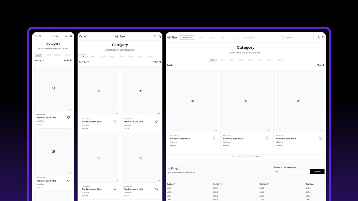
How do the two approaches work together on a full page?
Combining both approaches lets you build a responsive e-commerce product category page quickly:
- Product card (single responsive component): one card that scales across breakpoints using Auto Layout, min and max widths, and spacing tokens.
- Navigation and filters (breakpoint-specific variants): components that change layout based on screen size, making better use of the space available.
- Responsive grid layout:
screen/widthsets the frame width,grid/columns,grid/gutterandgrid/margincontrol the grid, and Auto Layout handles the reflow. Cards stack on mobile and spread across columns on desktop.
The same pattern works for other components. For more flexible layouts inside a single component, see my article on Figma slots in design systems and the Components docs.
FAQ
What’s the difference between a responsive component and a breakpoint-specific variant?
A responsive component has one structure that scales, using Auto Layout and tokens. A breakpoint-specific variant is a different design for each screen size, and a variable swaps between them. Use the first when only the sizes change. Use the second when the layout or behaviour changes.
Can a Figma variable switch a component’s variant?
Yes. A string variable can be bound to a variant property, so when the mode changes, the variable’s value changes and the instance shows the matching variant. The variable’s values must match the variant values exactly.
Are Flex’s typography tokens variables or styles?
Both. You apply text styles such as heading/md and body/md, and variables in the Semantic / Breakpoint collection control their responsive sizes behind the scenes.
Do I need Flex Design System to follow this guide?
No. Steps 1 to 7 work in any Figma file. Flex saves you the setup, because the breakpoint collection, modes and tokens are already built and documented.
Final Thoughts
Design tokens, Auto Layout and variants together make responsive design work faster and more reliable:
- Speed: global changes apply everywhere at once.
- Consistency: every component follows the same rules.
- Scalability: you can add breakpoints without starting over.
- Accuracy: breakpoint-specific variants switch automatically.
- Simplicity: fewer main components covering all screen sizes.
The main thing to get right is naming. The variable values and the variant values must match exactly, or the swap won’t work. Once they do, changing one mode updates the whole layout.
Try it with Flex Design System
Every example in this guide uses the Semantic / Breakpoint collection that comes with Flex, with spacing, grid, content width and viewport variant tokens already set up across Small, Medium and Large modes. Licences start at £29.99 as a one-off payment. See licence options →
Links
Flex Design System docs
Further reading
- Ethan Marcotte, Responsive Web Design, A List Apart (2010)
- Brad Frost, Atomic Design
- Figma Help Centre: Guide to variables in Figma
- Figma Help Centre: Modes for variables