Typography
Discover how Flex Design System manages responsive typography using styles and tokens.
Responsive typography
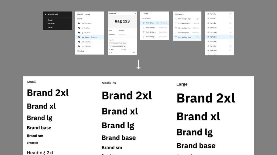
Flex Design System comes pre-built with a responsive and themed typography system.
It follows best practice and is powered by both text styles and variables.
By separating font size and font families into separate collections, typography can adapt to not only a different breakpoint (screen) size, but also a different themes (e.g. brand 1 or brand 2). This provides increased flexibility.
- Typography sizing is customised via the Breakpoint collection
- Font families etc are customised via the Theme collection
Customisation
A comprehensive set of text styles have been set up in Flex Design System to cover the most common use cases.
You can customise and extend these to your needs.
Text sizing will automatically respond, depending on the breakpoint mode (small, medium or large).
