Figma Library Guidelines: Does Figma Agent Follow Them?
I wrote guidelines files for Flex Design System and ran the same three prompts through Figma Agent three times to see which rules it follows.

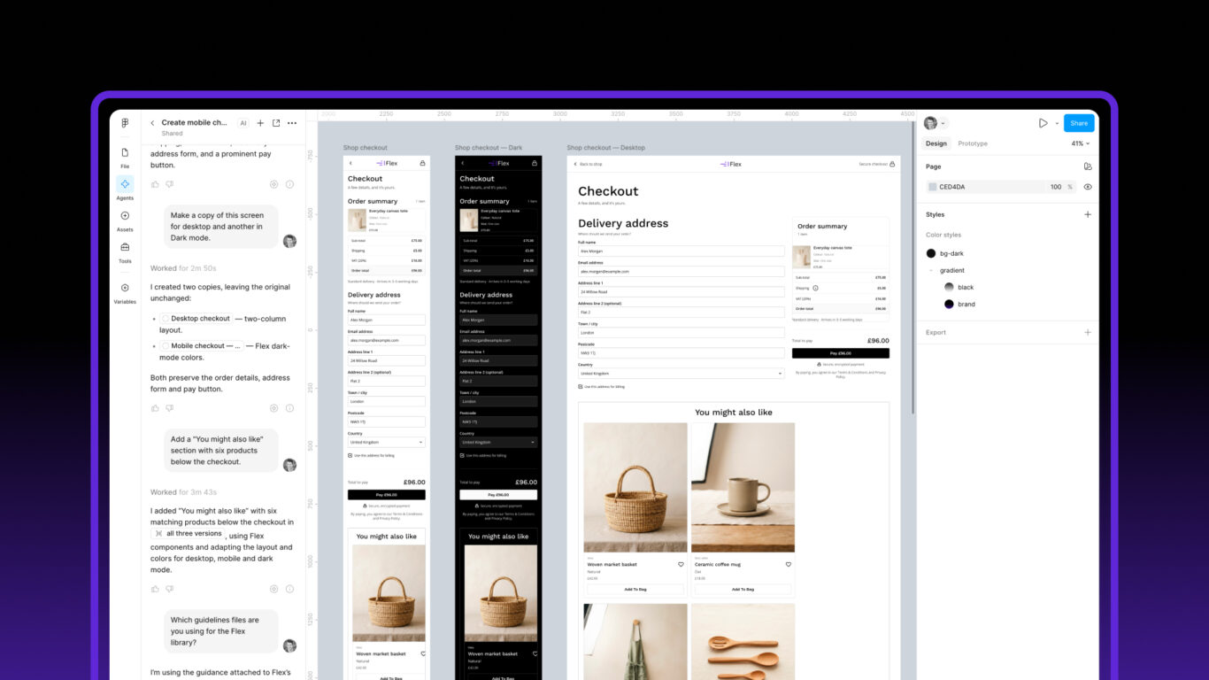
Table of contents
Figma now lets you attach guidelines files to a design library. These are plain Markdown files that Figma passes to Figma Agent whenever someone asks it to design with that library. I wrote a set for Flex Design System and ran the same three prompts through the agent three times to find out whether it actually follows them.
The short answer: Figma library guidelines help with tokens, theme modes and choosing components, and the agent followed those rules in every run. Layout rules were followed inconsistently, and adding more wording didn’t fix that. Below are the prompts, what happened in each run, what it cost in credits and what I changed as a result.
This is a follow-up to my Figma Agent review from July, where I tested the agent on design system maintenance tasks.
What are Figma library guidelines?
Guidelines are text files attached to a published library. According to Figma’s help article:
- They can be .md, .txt or .json files, up to 200 KB combined.
- You add them from the library file’s file menu: Library > Manage guidelines… > Upload, then Apply changes.
- Figma Agent receives them automatically whenever someone prompts with the library enabled. You don’t need to mention them in the prompt.
- They need a Professional, Organization or Enterprise plan, and edit access to the library file.
- Prompts may use more AI credits when a library has guidelines, because the agent reads them as extra context.
- They aren’t used when creating a Figma Make kit.
Flex already has descriptions on every variable, style and component, and the agent reads those too. Guidelines cover what descriptions can’t: how modes work across a whole screen, which component to choose when several look similar, and which mistakes to avoid.
What’s in the Flex guidelines?
I split the guidelines into six files, about 35 KB in total, well under the 200 KB limit:
| File | What it covers |
|---|---|
| overview.md | How Flex is organised, the variable collections and how modes work |
| tokens.md | Colour, spacing, radius and typography variables, and when to use each |
| components.md | Which component to use for common jobs, grouped by category |
| layout-and-responsive.md | Screen frames, breakpoint modes, full-width sections and slots |
| anti-patterns.md | Common mistakes, what to do instead and why |
| examples.md | Step-by-step recipes for common tasks |
Guidelines aren’t saved in a .fig file. When I imported and published the library from a .fig, the guidelines didn’t come with it. So the six files are now included as a separate folder in the Flex download, and the installation guide has a step for uploading them.
How did I test them?
I wanted each test to check rules that only exist in the guidelines, not in component or variable descriptions. If the agent followed one of those rules, that’s good evidence it read the guidelines.
Each run used a new design file with the Flex library enabled, and the same three prompts in order.
Test 1: a checkout screen
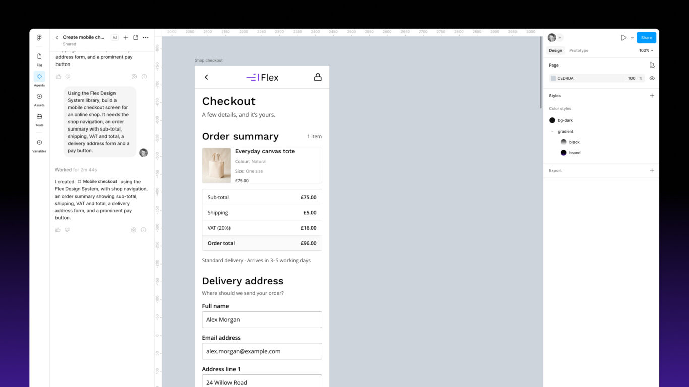
“Using the Flex Design System library, build a mobile checkout screen for an online shop. It needs the shop navigation, an order summary with sub-total, shipping, VAT and total, a delivery address form and a pay button.”
What I was checking: the Checkout Navbar instead of the main shop navbar, the Breakpoint mode set on the top-level frame, the frame bound to the screen/width and screen/height variables, spacing variables instead of typed values, and real components such as Order Summary Table and Text Input rather than shapes.
Test 2: desktop and Dark copies
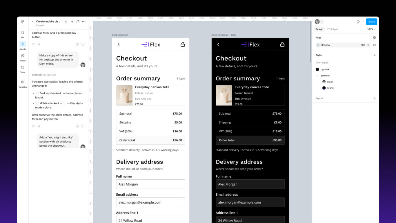
“Make a copy of this screen for desktop and another in Dark mode.”
What I was checking: whether it duplicates the frame and switches the Breakpoint and Theme modes, or rebuilds and recolours layers by hand.
Test 3: a related products grid
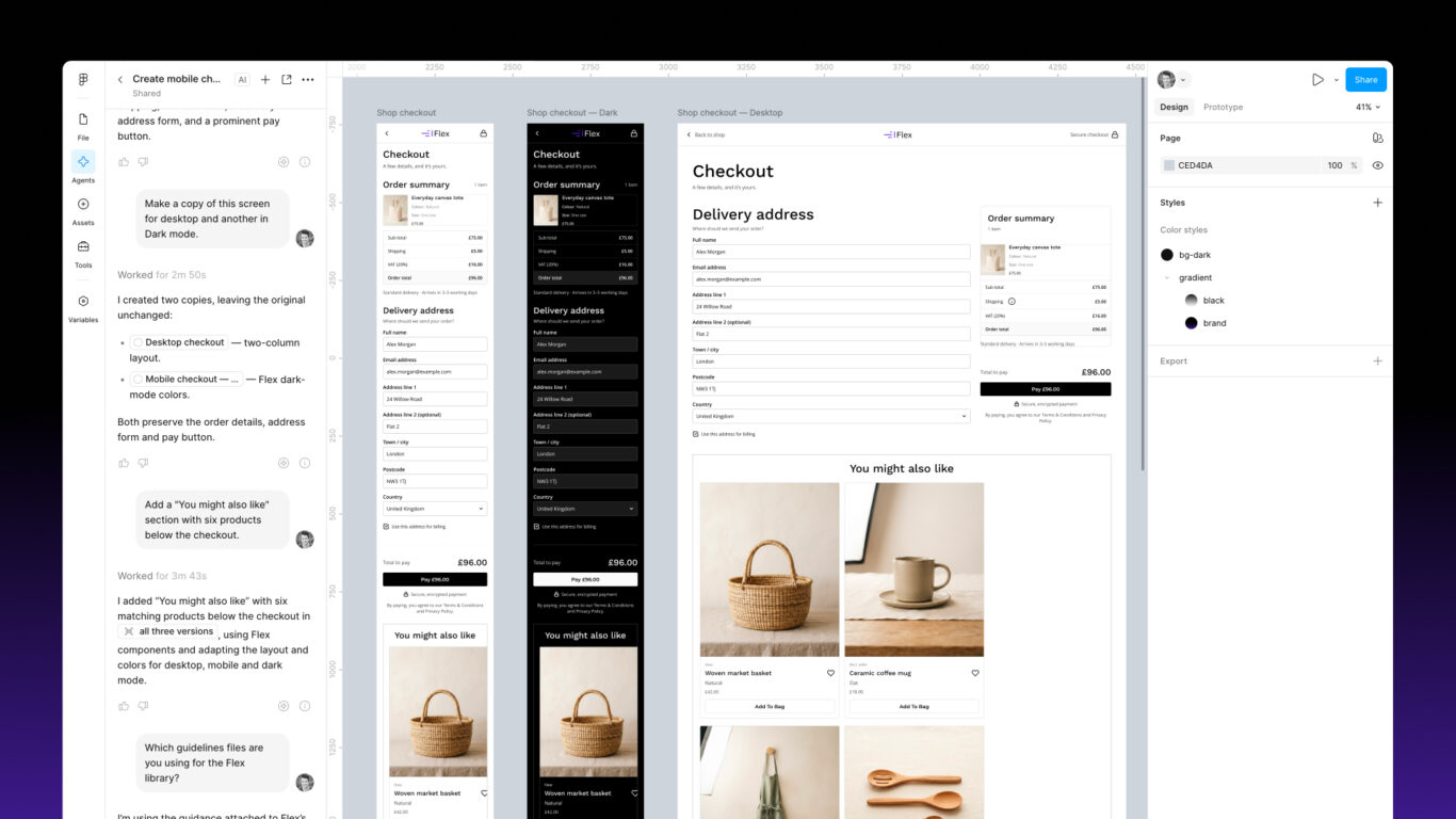
“Add a “You might also like” section with six products below the checkout.”
What I was checking: whether it uses the Related Products Grid component, adds six items to its slot and places the grid as a full-width section instead of inside a padded container.
A sanity question
“Which guidelines files are you using for the Flex library?”
What did Figma Agent follow?
Across all three runs, the agent consistently:
- Used the Checkout Navbar on the checkout screen, a rule that is only in components.md.
- Used Flex variables for colour and spacing instead of typed values.
- Used real components for the order summary and form fields.
- Created the Dark copy by switching the Theme mode to Dark, not by recolouring layers. That’s exactly what the guidelines ask for.
Test 1 passed in every run. That’s the part I’m most pleased with, because choosing the right component when several look similar is something descriptions alone struggle to explain.
Where did it go wrong?
Layout was the weak spot, and the problems changed from run to run.
Run 1
- Desktop: the agent built a bespoke two-column desktop layout instead of duplicating the screen and switching to Large. The “Delivery address” heading was clipped to “Delivery addre” and the form column was cut off at the bottom.
- Related products: it used Related Products Grid with six items, which is right, but nested it inside a padded frame. That broke the grid: an empty fourth column on desktop and one oversized card on mobile.
What I changed: I added a “Full-width sections” section to the layout guidelines, covered how to handle desktop and Dark requests, and added rules on hug heights, clipping and text wrapping, with matching entries in the anti-patterns file.
Run 2
- Desktop: two columns again, but this time nothing was clipped.
- Related products: still wrapped in a bordered, padded container, giving one narrow column on mobile and three columns plus an empty fourth on desktop. When I removed the wrapper by hand, the grid filled two columns on mobile and four on desktop, as designed.
What I changed: I accepted that people asking for a “desktop version” often want a different arrangement, so I changed the rule to: duplicate the frame, set it to Large, then rearrange (for example into two columns) while keeping the instances and variable bindings. I banned bordered or padded wrappers around full-width sections, and added a recipe for adding a section below existing content.
Run 3
- Checkout: a good result, but the first attempt failed with an error and I had to run the prompt again. The failed attempt still used credits.
- Desktop: two columns, which was now allowed, but the frame was set to a fixed 1024 px instead of being bound to
screen/width. - Related products: worse than before. The Light mobile screen built its own product grid instead of using the component. The Dark mobile screen used the component but squeezed all six cards into one row, with text wrapping one letter per line. On desktop the grid was inside a bordered container again. The agent finished with: “Sorry, I cannot modify the size, rotation, alignment, position, or constraints of sub-layers inside a component instance.”
Was it the guidelines or the library?
The squeezed grid in run 3 led me back to the library itself. The Related Products Grid slot uses a horizontal wrap layout and stretches each card to fill when it’s inserted. The product cards had no minimum width, so all six shared one row and shrank instead of wrapping. The agent then tried to resize layers inside the instance, which Figma doesn’t allow, and gave up.
That’s a component problem, not an agent problem. The same issue explained something I’d seen in run 2, where product titles broke mid-word (“Structu red Tote”) even in my own corrected version.
I’ve since added a minimum width, bound to a content/width-md variable, to ten card components, so cards in grids and slots wrap onto a new row instead of squeezing together. That was included in version 1.1.10. I haven’t re-run test 3 since that update.
The lesson for anyone writing guidelines: when the agent keeps getting something wrong, check the component before adding more rules. Some of what looked like the agent ignoring the guidelines was the library making the right result hard to get.
Does the agent know it’s using guidelines?
Not reliably. In run 1, it said it used “the guidance supplied with the enabled Flex library” but couldn’t name the files. In run 2, it said it was using guidance attached to the published components, styles and variables, “not a separately supplied Flex guidelines document”. In run 3 the answer was vague again.
So asking the agent isn’t a useful check. The only way I could tell whether a rule was followed was to test it against something that only the guidelines say.
How many credits did it use?
| Run | Test 1 | Test 2 | Test 3 | Question | Total |
|---|---|---|---|---|---|
| 1 (8 Oct) | 72 | 240 | 498 | 18 | 828 |
| 2 (9 Oct) | 80 | 66 | 288 | 4 | 438 |
| 3 (9 Oct) | 140* | 218 | 424 | 6 | 788 |
* Includes a failed first attempt that was still charged.
That’s 2,054 credits across the three runs. The runs aren’t directly comparable: run 1 generated product photos, while later runs used image placeholders, which probably explains most of the drop in test 3 between runs 1 and 2. I didn’t run the same prompts on a library without guidelines, so I can’t say how much of the cost the guidelines themselves added.
For context, I’m on Figma’s Professional plan with a Full seat, which includes 3,000 AI credits a month. These three runs used about two thirds of that, and a single run used between 15% and 28%.
Are Figma library guidelines worth adding?
For a design system, I think so, with realistic expectations. In my tests the guidelines reliably steered the agent towards the right variables, modes and components, which are the things that make generated screens fit a system instead of just looking like it. Layout rules helped less, and repeating them in more detail didn’t make them stick.
If you’re writing guidelines for your own library:
- Test rules that only exist in the guidelines. Otherwise you can’t tell whether the agent read them.
- Keep each rule short and specific. Name the exact component or variable.
- Fix the library first when the agent struggles with the same component in every run.
- Budget for credits. Each full run of my three prompts cost 400 to 800 credits, out of 3,000 a month on a Full seat.
- Include the files in your download. If you sell or share a library as a .fig, the guidelines won’t come with it.
FAQ
Do Figma library guidelines come with a .fig file?
No. When I imported and published Flex from a .fig, the guidelines weren’t included. Share them as separate files, and have people upload them via Library > Manage guidelines….
Which Figma plan do guidelines need?
Professional, Organization or Enterprise, plus edit access to the library file.
Do guidelines use more AI credits?
Figma says prompts may use more credits when a library has guidelines, because the agent reads them as extra context. I didn’t measure the difference directly.
Can I check which guidelines the agent is using?
Not by asking it. Its answers were vague or contradictory in all three runs. Test a rule that only the guidelines contain instead.
Final thoughts
Library guidelines are an impressive start, and better than using Figma Agent blind. In every run they got the agent choosing the right components, using Flex variables and switching modes properly. But in my opinion they don’t make it a prompt-and-go solution.
I’d use the agent to speed up early wireframes, not to produce finished artefacts. Looking back, I’d also prompt differently. I’d correct the mobile screen first, before asking for a desktop copy. And from experience, I’d expect a two-column layout on desktop for a checkout like this, so asking for that directly would probably have given better results.
Then there’s the cost. These tests covered only a few screens and used about two thirds of my monthly credits. Real projects can involve tens, if not hundreds, of screen variants across flows, which would soon use up a credit allowance.
In a future follow-up, I’d like to test whether giving the agent a spec for each screen in a flow or journey produces more accurate results.
If you use Flex with Figma Agent, the guidelines are in the download and the AI guidelines docs explain how to add them.