Components
Discover how Figma components work and how they’re organised in Flex Design System.
What is a component?
Components are elements you can reuse across your designs such as a button or product card.
They help to create and manage consistent designs across projects.
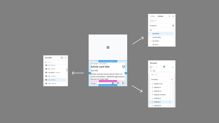
To ensure Flex Design System is as easy to use as possible, all components have been built with consistent approach and are controlled using the included design tokens.
- Common naming conventions
- Logically ordered overrides
- Nested instances
- Variants (where applicable)
- Responsive sizing (where applicable)
Component Variations
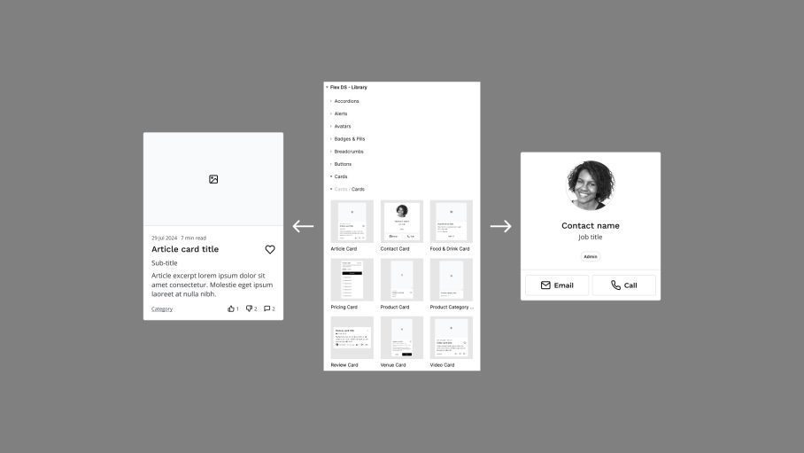
Components have been designed using using variants to ensure they are flexible enough to cover common use cases.
Access components and their variations from the assets panel.

Component Overrides
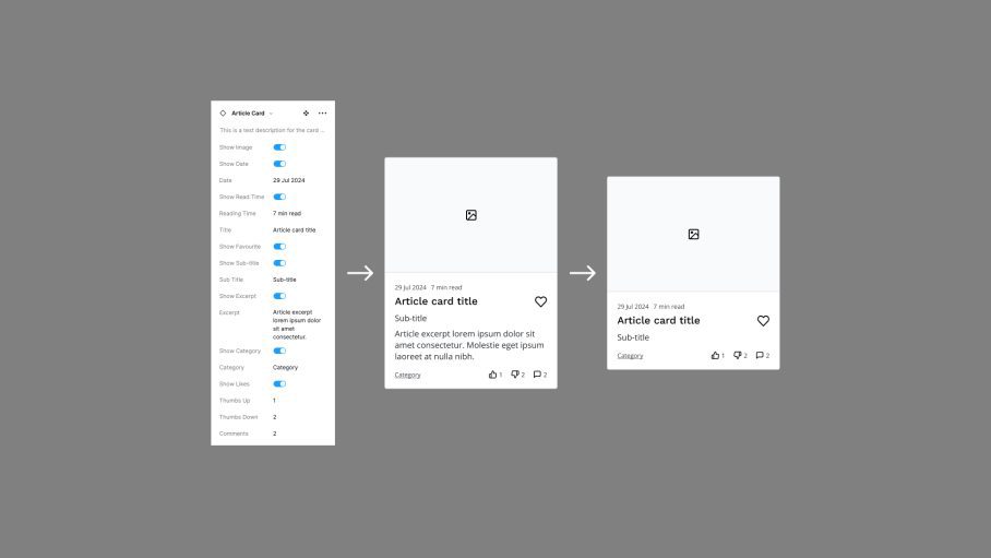
In addition, each component has extensive overrides so they can be further customised, depending on your needs.
Customise the default component to meet your needs using the overrides panel.

Component Properties
Components share a common set of properties, powered by the in-built design tokens.

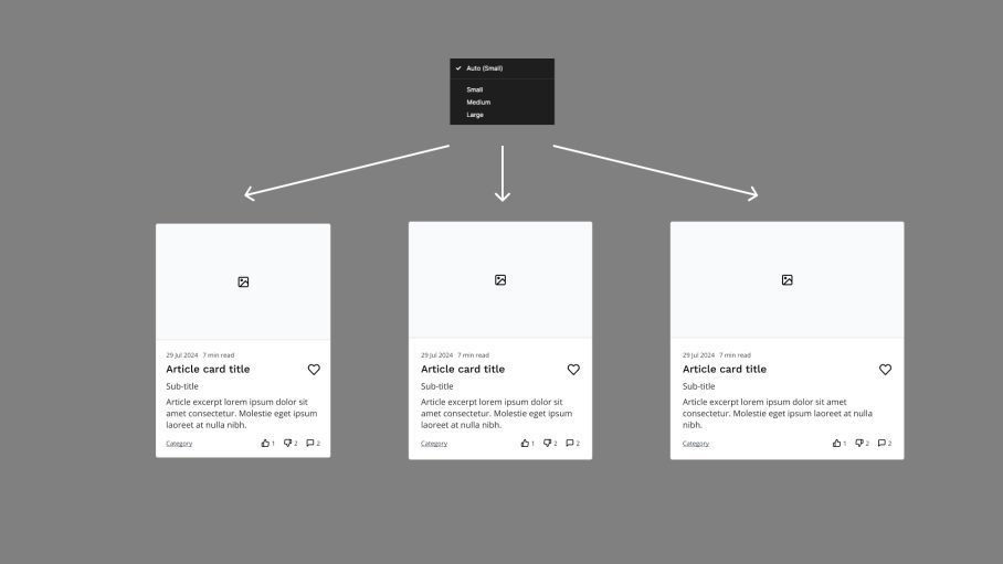
Components & Modes
Components automatically react to their context by changing the modes of the parent frame (breakpoint, theme or language).
