File Structure
See how the Flex Design System file is organised into pages, components and variables.
How is the file organised?
The file is divided into eight sections. Section names are in capitals in the Pages panel, with their pages listed underneath.
- COVER
- CONFIGURATION
- USE CASES
- FEATURE DEMOS
- DEVICES
- BASE
- COMPONENTS
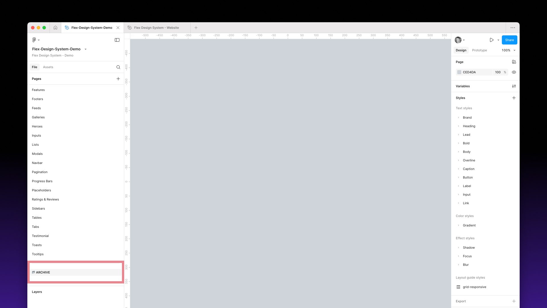
- ARCHIVE
1. COVER
The file thumbnail and title page.

2. CONFIGURATION
- Designer’s Guide: an overview of how the system works, including how to customise variables, tokens and modes.
- License: a copy of the licence terms.
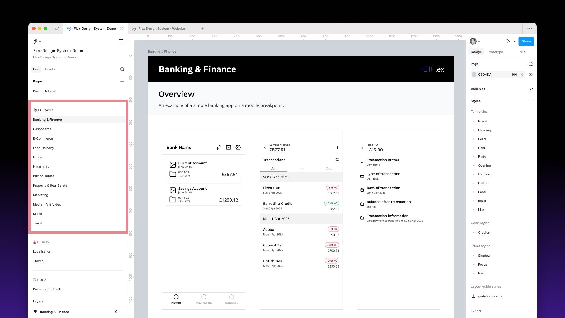
3. USE CASES
Example screens built entirely from Flex components: Banking & Finance, Dashboards, E-Commerce, Food Delivery, Forms, Hospitality, Property & Real Estate, Marketing, Media, TV & Video, Music, Table Booking and Travel.
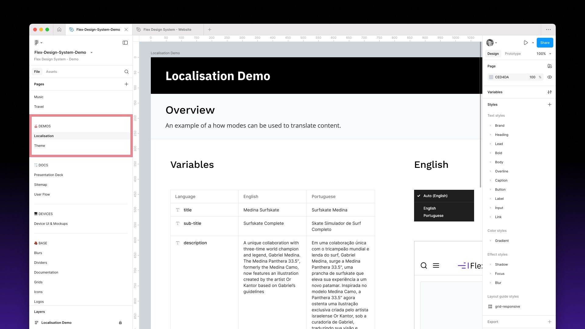
4. FEATURE DEMOS
Pages demonstrating specific features:
- Data: Figma Agent, Data: Variables, Data: Google Sheets and Data: JSON: different ways to populate designs with real content.
- Theme: light and dark themes applied to selected components.
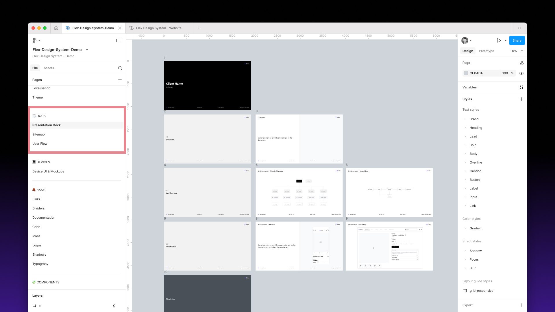
- Presentation Deck, Sitemap and User Flow: components for presenting work to teams and stakeholders.
- Slots: components that use Figma slots.
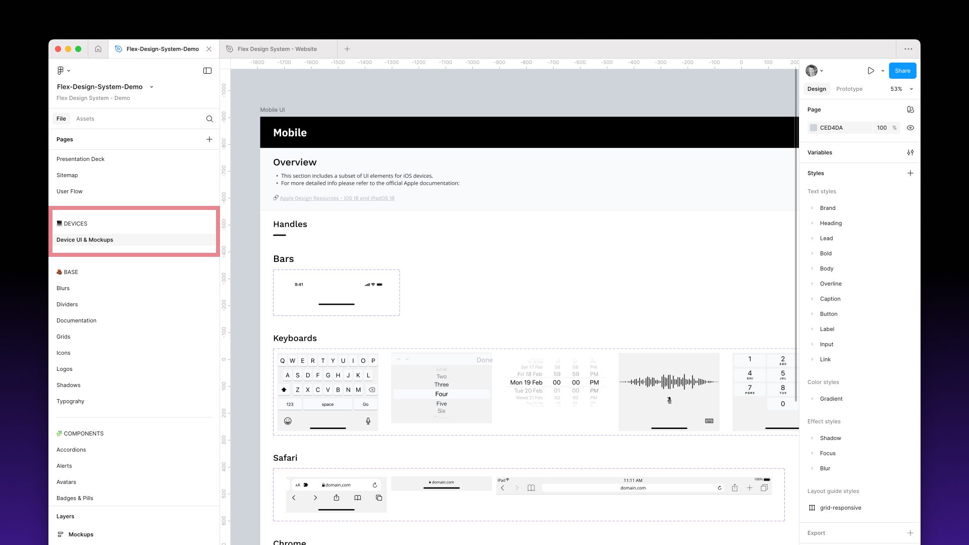
5. DEVICES
Device UI & Mockups: common device UI elements, such as keyboards, plus device mockups for presenting your screens. You can also use the official Apple and Google resources in Figma if you prefer.
6. BASE
The foundations and building blocks used inside the main components:
- Styles: Blurs, Grids, Shadows and Typography. These pages show every effect, grid and text style in the system, each with a usage description.
- Assets: Dividers, Icons, Images and Logos.
- Documentation: presentation components for sharing work with teams and stakeholders, including annotations, sitemap and flow elements, slide deck layouts, and document headers and footers.

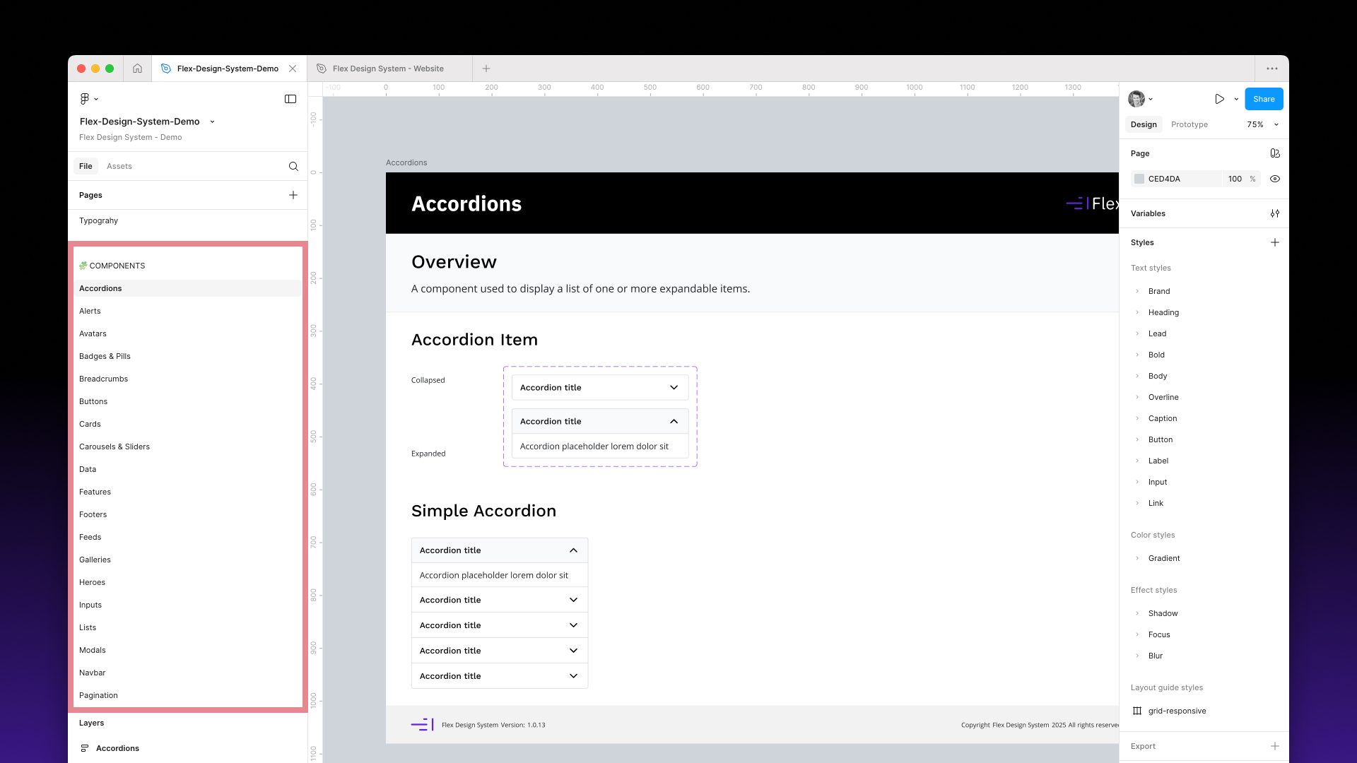
7. COMPONENTS
The full component library, with one page per component type:
Accordions, Alerts, Avatars, Badges & Pills, Banners, Breadcrumbs, Buttons, Cards, Carousels & Sliders, Content Grids, Feeds, Footers, Galleries, Heroes, Inputs, Lists, Modals, Navigation, Pagination, Progress Bars, Ratings & Reviews, Tables, Tabs, Toasts and Tooltips.
Every component is responsive and themed, with variants, overrides, descriptions and states such as hover and focus. Many grid and list components support Figma slots.
8. ARCHIVE
An optional area for archiving old versions of components and screens.