Grids & Spacing
Learn how Figma grid layouts work and how Flex Design System uses a responsive grid.
What are grids?
Grids are fundamental building blocks of modern user interfaces.
Within Figma, the layout grid lets you set up one or more grids that help to keep your screen elements aligned.
Responsive Layout Grid
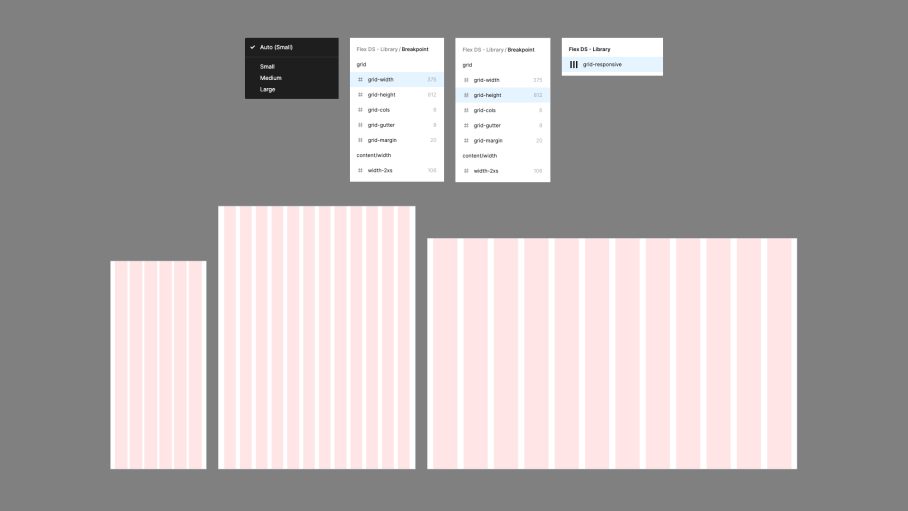
Flex Design System includes a single responsive grid that automatically adapts to the parent mode (small, medium or large).
- Set the breakpoint mode on the parent frame: small, medium, large.
- Enable auto layout and set the grid width, height, margin and gutter tokens to the parent Frame.
- The grid will now adapt to whatever the parent frame mode is set to.
- Child components should then respond accordingly.
- Customise these styles to suit the needs of your project.

Responsive Component Spacing
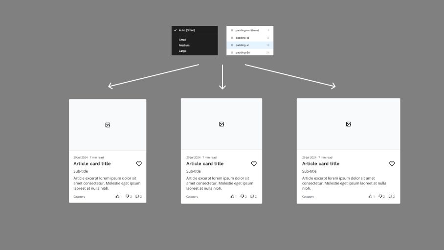
Use the built spacing tokens to control spacing within and around components.
Due to the way the tokens have been set-up, applying a breakpoint mode to the parent frame will allow your components to automatically adjust their size.
You can customise this behaviour within the breakpoint collection.
