Checking Figma Colour Contrast in Dark Mode with Claude
I asked Claude to build a test sheet of every Flex component in Light and Dark mode, then scan every text layer for WCAG AA contrast. I fixed the tokens; it rescanned until everything passed.

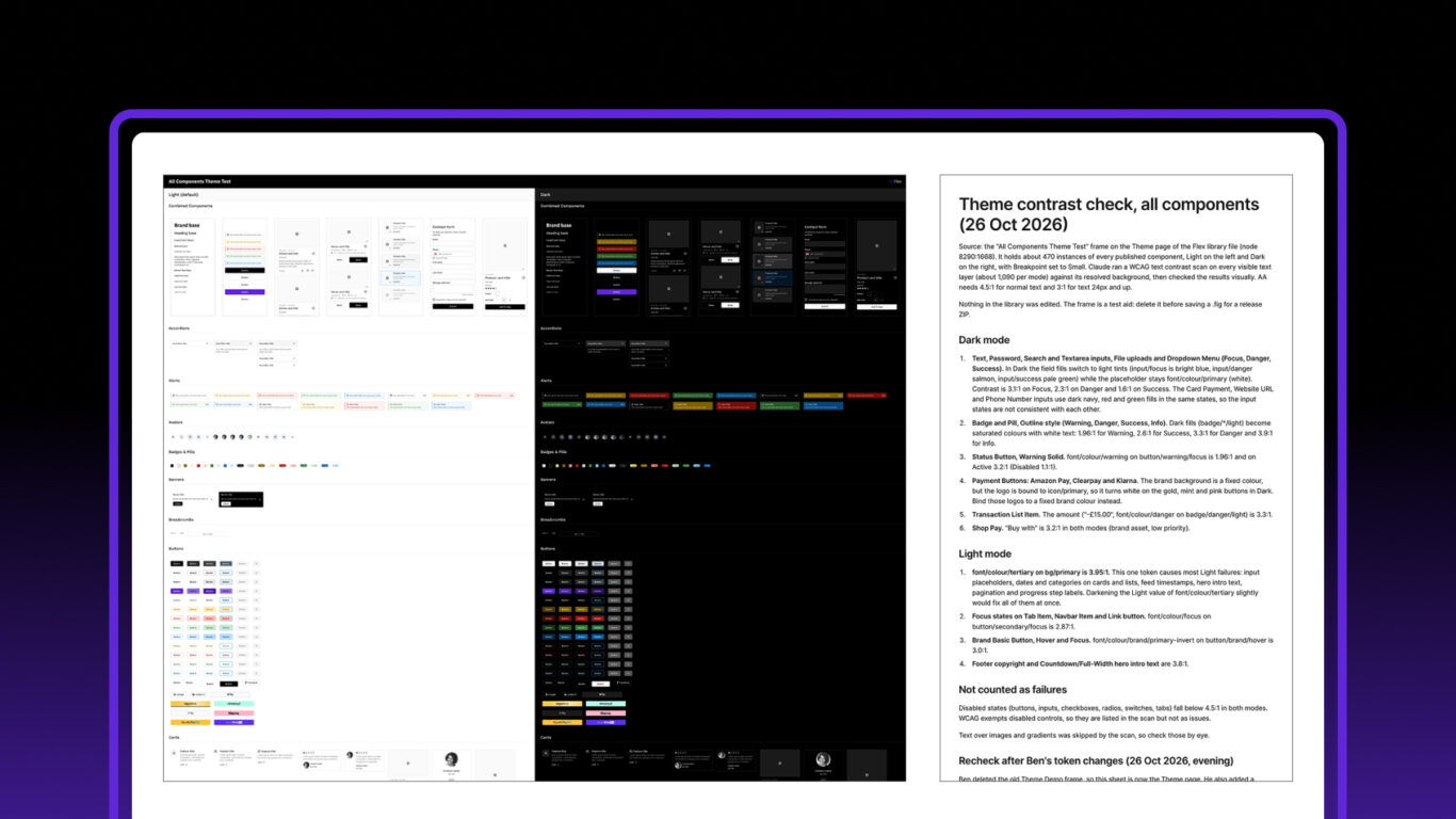
Table of contents
I’d already checked the colour contrast in Flex Design System by hand, in Light and Dark mode, selecting elements one at a time and reading the WCAG rating in Figma’s colour picker. It’s a repetitive job across every component and state, and when Claude checked the same library, it found quite a few that I’d missed: focus states on status buttons, placeholders inside danger inputs, and text tokens that were only just under the threshold. I wanted every component checked, in every state, in both modes, without relying on my attention holding out.
So I used Claude, connected to Figma through Figma MCP, to run a colour contrast check across the whole library. It built a test sheet of every component, scanned about 1,500 text layers per mode against WCAG AA, and told me what failed. I made the fixes myself, then asked it to scan again. After nine scans over two days, every text layer in Light and Dark passes, excluding disabled states. The fixes are in release 1.1.14.
Flex is built by hand and audited with AI. This article covers how the check worked, what it found, what went wrong along the way, and where it still needs a person.
Why check contrast in Dark mode?
I mostly use Flex for wireframing, so its Dark mode started as a proof of concept: a way to show that the Theme tokens switch cleanly between modes. If you want to take Flex beyond wireframes and into UI design, though, a Dark mode is only useful if the text in it can be read. Having one built in, with text contrast checked in both modes, saves you doing that work yourself.
Contrast often gets checked once, in Light mode, when the colours are first chosen. Dark mode is where token-based libraries break quietly. A text token and a fill token can each look right on their own, then switch to values in Dark that don’t work together. Nothing errors and nothing looks broken on the main screens, so it goes unnoticed until someone tries to read a warning badge.
For text, WCAG 2.2 AA (criterion 1.4.3) asks for:
- 4.5:1 for normal text.
- 3:1 for large text (24px and up, or 18.66px bold).
- No minimum for disabled or inactive controls, which are exempt.
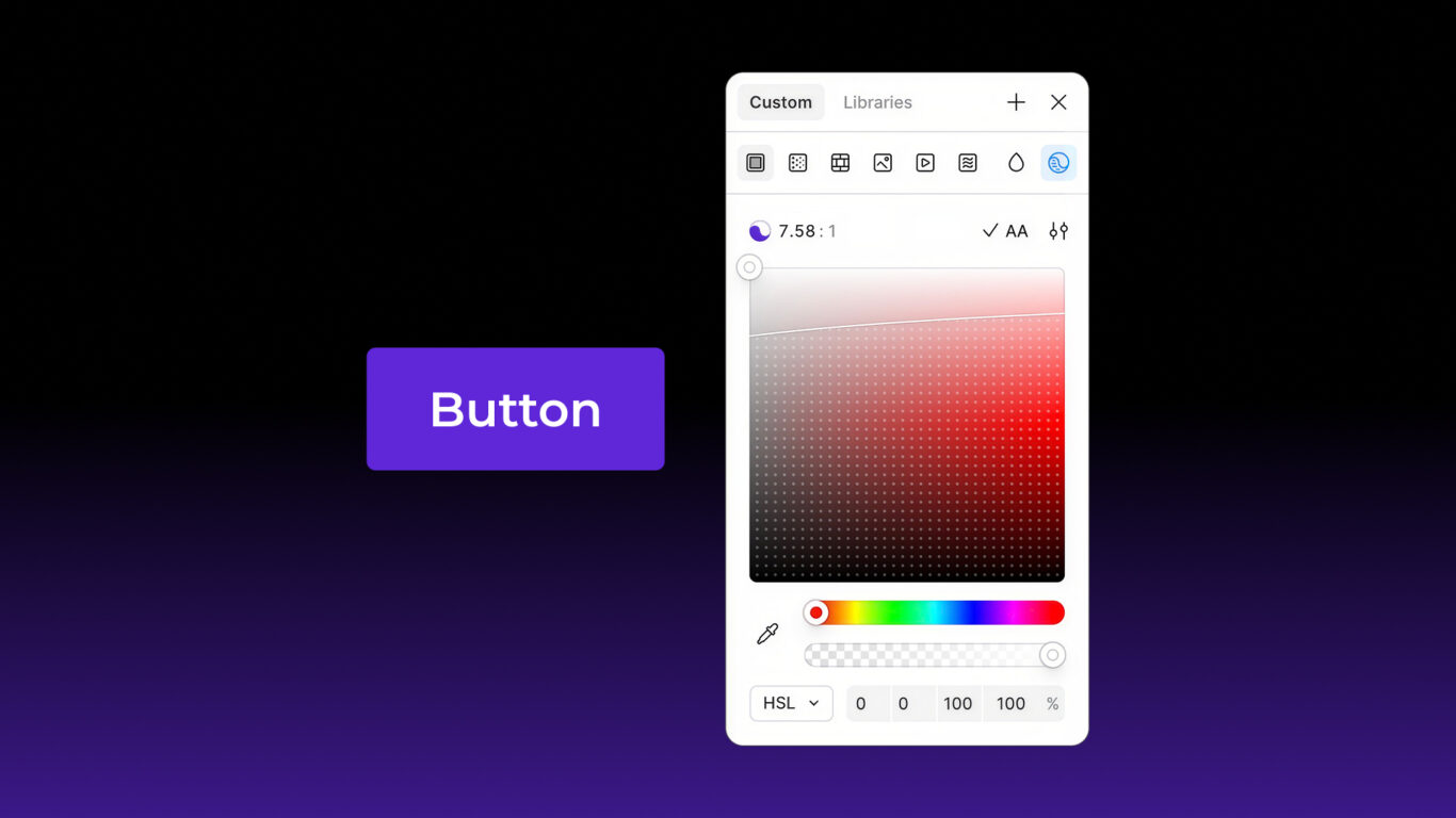
Figma’s colour picker has a built-in contrast checker: select a text layer, open its fill and it shows the ratio against the background, with the WCAG rating. That’s how I’d checked Flex before. It works, but only one element at a time, in one mode at a time, and again after every token change. Across every component, state and mode it’s slow and repetitive, which is exactly when things get missed.
How did I set up the test?
Flex already had a Theme page with a few components in Light and Dark. To check contrast properly, I wanted every component in one place, so I could compare them all side by side in both modes instead of going page by page. I asked Claude to rebuild it with every component:
“I created a theme demo page here with select components to test light and dark mode. This was fine, but I want to be able to test all the components in both light and dark mode so I can catch any accessibility errors. Can you create an additional frame that tests all components and adds them to the canvas in a neat and tidy way like I already did, essentially like a UI sheet?”
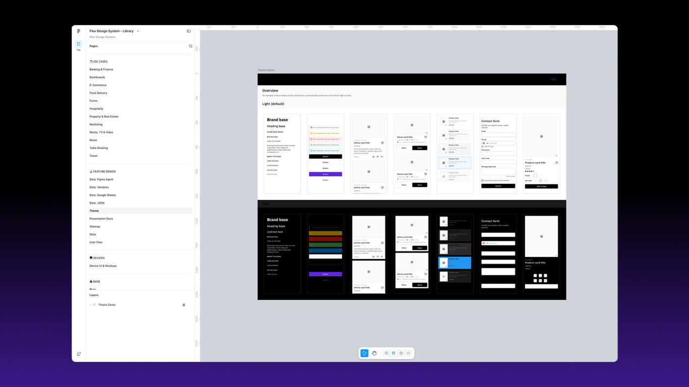
Claude went through the 25 component pages and built an “All Components Theme Test” frame beside my demo, with one row per component page. Light sits on the left and Dark on the right, so each component is next to its Dark version, and both columns use the Small breakpoint. It used my own Document Header, Section Title and Title components for the headings, and only Semantic tokens for the frames it made. It didn’t edit any components or variables. The first version held about 470 instances.
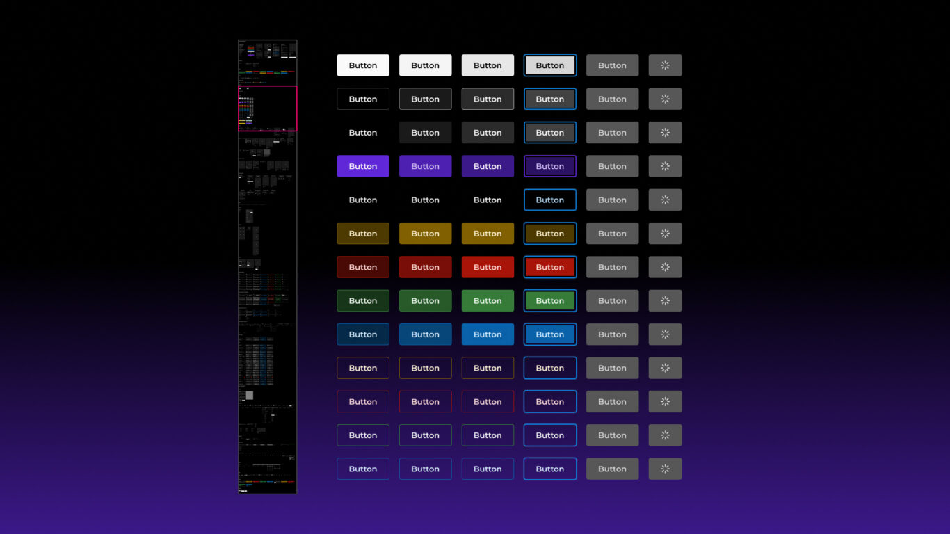
It wasn’t complete. Claude had left out some of the button states, so I added them by hand: 71 buttons per mode. I also added a row of my demo screens to each column, to see how the components behave together in real layouts. The final sheet held 1,164 instances, and I deleted my old demo frame and kept this one as the Theme page.
I ran it in the Claude desktop app, inside my Flex project in Claude, with Figma connected through Figma’s remote MCP server. I’m on Figma’s Professional plan and Claude Pro.
How does Claude check contrast through Figma MCP?
I asked Claude afterwards to explain its method step by step. Through the Figma MCP server, it only reads the file and changes nothing:
- Read the sheet. Open the All Components Theme Test frame, with every component in Light and Dark at the Small breakpoint.
- Collect every text layer. List the visible text layers in each instance, about 1,500 per mode, with each layer’s fill colour, font size and weight.
- Find the real background. Go up through the layer’s parents until one has a solid fill, then resolve that variable for the column’s mode.
- Calculate the ratio. Use the WCAG formula and compare it with 4.5:1, or 3:1 for large text.
- Filter. Skip Disabled states, and flag text over images or gradients to check by eye.
- Group by token. Report each failure by the token pair behind it.
- Check visually. Screenshot the flagged components in both modes to confirm the numbers match what’s on screen.
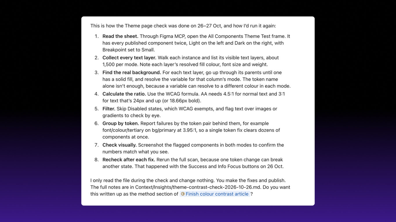
Step 3 is the one that matters in a library built on variables. A token name doesn’t tell you the colour, because the same variable resolves to a different value in each mode. The check has to resolve every fill for the mode it’s in, which is exactly what’s tedious to do by hand.
It reported each failure with the component, state, mode, the tokens involved and the ratio. The tokens turned out to matter most: a list of tokens tells you what to fix, while a list of components only tells you where to look.
The scan had limits, which Claude listed itself:
- It skipped text over images and gradients.
- It didn’t check non-text contrast, such as borders, icons and focus rings (WCAG 1.4.11).
- Disabled and unavailable states were listed but not counted as failures.
What did the first scan find?
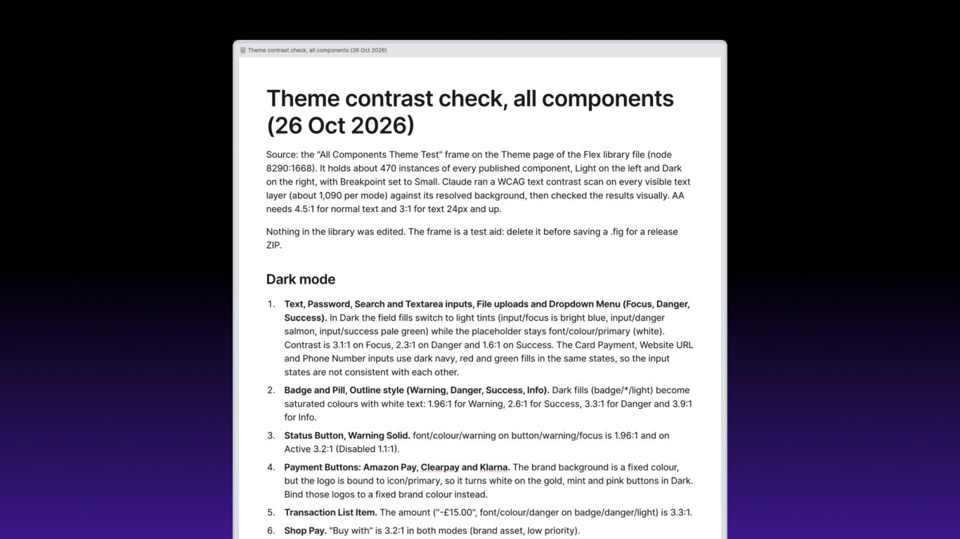
The first scan covered about 1,090 text layers per mode. Grouped by cause, the main problems were:
One token caused most of the Light failures. font/colour/tertiary on bg/primary was 3.95:1. It’s used for input placeholders, dates and categories on cards, feed timestamps, captions, pagination and progress step labels, so one value was failing across dozens of components.
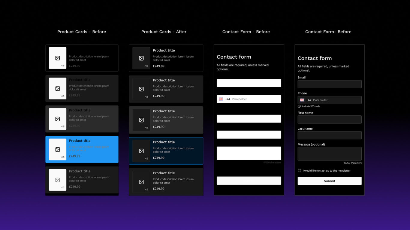
Dark input states. In the Text, Password, Search and Textarea inputs, plus File Upload and the Dropdown Menu, the Focus, Danger and Success fills switched to light tints in Dark, while the placeholder text stayed white. Contrast was 3.1:1 on Focus, 2.3:1 on Danger and 1.6:1 on Success. The Card Payment, Website URL and Phone Number inputs used dark fills for the same states, so the inputs weren’t consistent with each other either.
Outline Badges and Pills in Dark. The light fills became saturated colours with white text: 1.96:1 for Warning, 2.6:1 for Success, 3.3:1 for Danger and 3.9:1 for Info.
Payment button logos. The Amazon Pay, Clearpay and Klarna logos were bound to icon/primary, so in Dark they turned white on gold, mint and pink buttons. The brand backgrounds were fixed colours; the logos weren’t.
Focus states in Light. Focus text on the Tab Item, Navbar Item and Link button was 2.87:1.
Smaller ones included the Warning Solid Status Button in Dark (1.96:1 on Focus), the Brand button’s Hover and Focus states in Light (3.0:1), a transaction amount (3.3:1) and the footer copyright and hero intro text (3.8:1).
How did I fix it?
I changed the tokens in Figma; Claude rescanned and reported what was left. My prompts from that point were short:
“I’ve updated some tokens to improve the accessibility. You can check the page again if you wish.”
“Can you re-run the check and tell me what doesn’t pass now?”
| Scan | What passed now | What still failed |
|---|---|---|
| 26 Oct, 20:32 | First scan, about 470 instances | Tertiary text (Light), Dark input states, outline Badges and Pills, payment logos, focus states and more |
| 26 Oct, 20:53 | Dark input states, Danger outline Badge and Pill, Amazon Pay and Clearpay logos, transaction amount | Warning, Success and Info outline Badges and Pills (Dark), Warning Status Button, Klarna logo, tertiary text, focus states |
| 26 Oct, 21:10 | Buttons only, after I added the missing states (71 per mode) | Brand button Hover and Focus, Link Focus (Light); Warning Solid Status Button Focus and Active (Dark) |
| 26 Oct, 21:30 | Success and Info outline Badges and Pills, Warning Status Button, Brand button | Warning outline Badge (3.18:1), new Success and Info Status Button Focus failures (Dark), tertiary text and focus states (Light) |
| 27 Oct, 10:30 | Warning outline Badge and Pill, Card Payment input, Klarna logo, Navbar Focus | Success and Info Status Button Focus (Dark); tertiary text, Tab and Link Focus, footer and hero text (Light) |
| 27 Oct, 10:40 | Tertiary text, Tab Focus, footer and hero text | Status Button Focus (Dark); Link Focus and inactive progress steps (Light) |
| 27 Oct, 10:45 | Everything in Dark | Link Focus and inactive progress steps (Light) |
| 27 Oct, 10:55 | Link Focus, Stepped Progress Bar | One label in the Progress Step component (Light) |
| 27 Oct, 11:00 | Everything | Nothing, excluding disabled and unavailable states |
The biggest single change was the tertiary text token. Darkening its Light value cleared the largest group of failures at once, across about 50 components and the demo screens. That’s the advantage of a token-based library: when one token is the cause, one change is the fix.
I chose the new values by hand. For each failing component Claude flagged, I moved the token to the next shade in its colour ramp. Then I detached the token on one instance and checked the result in Figma’s colour picker, the same way I’d checked contrast before. I did that for each token, one at a time. Claude was good at finding the failures and naming the tokens behind them, but picking the replacement colour was still my call.
For the payment logos, I bound them to a fixed black instead of icon/primary, so they no longer switch with the mode, the same way the brand backgrounds don’t.
What went wrong along the way?
These are the useful parts, so I’ve kept them in.
A fix caused a new failure
At 21:10 the Success and Info Solid Status Buttons passed in Focus. At 21:30 they failed, at 2.63:1 and 3.86:1. The most likely cause was a token I’d changed in between to fix something else. Without a full rescan I’d have assumed they were still fine. This is the strongest argument for scanning everything every time, rather than only the things you’ve just changed.
Renaming brand tokens broke a button that passed
The same afternoon, for release 1.1.15, I reworked the brand text colours: I renamed primary-invert and secondary-invert to primary-light and secondary-light with new shades, and added primary-dark and secondary-dark. The rescan showed that the Brand button’s Default and Active labels were still bound to the renamed token. What had been light text on the brand fill was now a mid purple, at 1.9:1 in Light.
It took three more scans to get right. I added a white primary-invert token for the labels, which fixed Default and Active but left Hover and Focus at 3.99:1. Switching those to primary-dark made them worse, as low as 1.28:1 in Dark, because the fills hadn’t changed. Moving primary-dark to a much darker shade in Light and a lighter one in Dark finally passed: 4.56:1 for Hover and Focus in Light, just over the line.
Claude also gave me the ratio of each brand text token on the page background, so the limits are now in the token descriptions. In Light, primary-light, secondary and secondary-light only pass at 24px and up, and primary-dark shouldn’t be used for text in Dark.
Inactive isn’t disabled
WCAG exempts disabled controls, so Claude didn’t count disabled text as failing. But it flagged that the inactive step labels in Progress Step and Stepped Progress Bar used font/colour/disabled at 3.95:1. An inactive step in a progress bar still tells people where they are in a process, so they need to be able to read it. I didn’t think the exemption applied, and I moved those labels to a text token that passes.
The ratio alone couldn’t settle that. Claude raised the question and I made the call. It was also right to keep the genuinely unavailable items exempt: unavailable dates and times in the Date and Time Pickers, an out-of-stock size in the Size Picker, and “Previous” on page 1 of pagination.
Disabled buttons in Dark aren’t consistent
Disabled states don’t need to meet WCAG, but the scan showed they don’t match each other in Dark. Primary and Brand Disabled buttons are 1.6:1, and Success and Info Disabled are 1.7 and 2.2:1, while Warning and Danger Disabled pass. It’s a consistency problem more than an accessibility one, and it only came up because every button type was on the sheet.
I made the Disabled buttons consistent across every type in release 1.2.0 (29 October).
The test sheet was missing states
The first sheet left out some button states. I spotted it because I know the components; the scan couldn’t have, because it can only check what’s on the canvas. A contrast check is only as complete as the test sheet behind it, so check the sheet before trusting the result.
What’s the result?
All 1,509 text layers per mode now meet WCAG AA contrast in both Light and Dark, excluding disabled and unavailable states. The fixes are included in release 1.1.14 (27 October 2026), with the brand text changes in 1.1.15 the same day. Buyers get every new release free through their download link.
What the check doesn’t cover yet:
- Non-text contrast (3:1 for borders, icons, focus rings and input outlines).
- Text over images and gradients.
- Everything else in WCAG that depends on how a design is built in code, such as keyboard order and screen reader labels.
So I’d describe Flex’s text contrast as meeting WCAG AA in both modes, not Flex as “fully accessible”. Contrast is one criterion out of many.
The test sheet stays on the Theme page, and it’s included in the buyers’ file, so you can check your own changes against it. When I add a component or change a Theme colour, I’ll rerun the scan before the release, so the result doesn’t go out of date.
Is an AI contrast check worth doing?
Yes. Checking text contrast with Claude through Figma MCP was far more accurate than checking by eye or one layer at a time in the colour picker. It looked at every text layer in both modes, every time, so nothing depended on my attention holding out. That’s how it found the problems I’d missed in my own check.
It didn’t do everything. I still chose and corrected the new values by hand, and Claude missed some component states when it rebuilt the Theme page. I added those myself, then checked everything again. The biggest saving was in finding the issues. Finding them by hand would have taken me far longer than fixing them did, and each rescan took about a minute.
FAQ
Can Claude check colour contrast in Figma?
Yes, when it’s connected to Figma through Figma MCP. In my test it checked every visible text layer against its background in Light and Dark mode and reported the ratio for each failure. It skipped text over images and gradients, and didn’t check non-text contrast such as borders and icons.
Do disabled states need to meet WCAG contrast?
No. WCAG 1.4.3 exempts text in inactive user interface components. Be careful with “inactive”, though: an inactive step in a progress bar still carries information, so I treated it as normal text.
Does Dark mode need its own contrast check?
Yes. Tokens that pass in Light can switch to values in Dark that don’t work together. In Flex, most Dark failures were in states such as Focus, Danger and Success, which you rarely see on demo screens.
Does a contrast check replace an accessibility audit?
No. Text contrast is one WCAG criterion. Non-text contrast, keyboard access, focus order, screen reader labels and target sizes all need checking too, and most of those depend on the coded product, not the Figma file.
Final thoughts
Claude did the checking and I made the decisions: which colours to use, which states were missing from the sheet and whether an inactive step counts as disabled. That split worked well. If I ran it again, I’d give Claude a list of every component state up front, so the test sheet is complete from the first scan.
If you’d like a Figma library whose text contrast is checked in both modes, Flex Design System includes every fix from this article.
Links
- W3C: Understanding Success Criterion 1.4.3 Contrast (Minimum)
- W3C: Understanding Success Criterion 1.4.11 Non-text Contrast
- Figma: Guide to the Figma MCP server
- Figma Agent Review: Real-World Testing, Prompts and Results
- Figma Library Guidelines: Does Figma Agent Follow Them?
- Design Smarter with Design Tokens in Figma
- Flex docs: Figma Variables
- Flex docs: Changelog